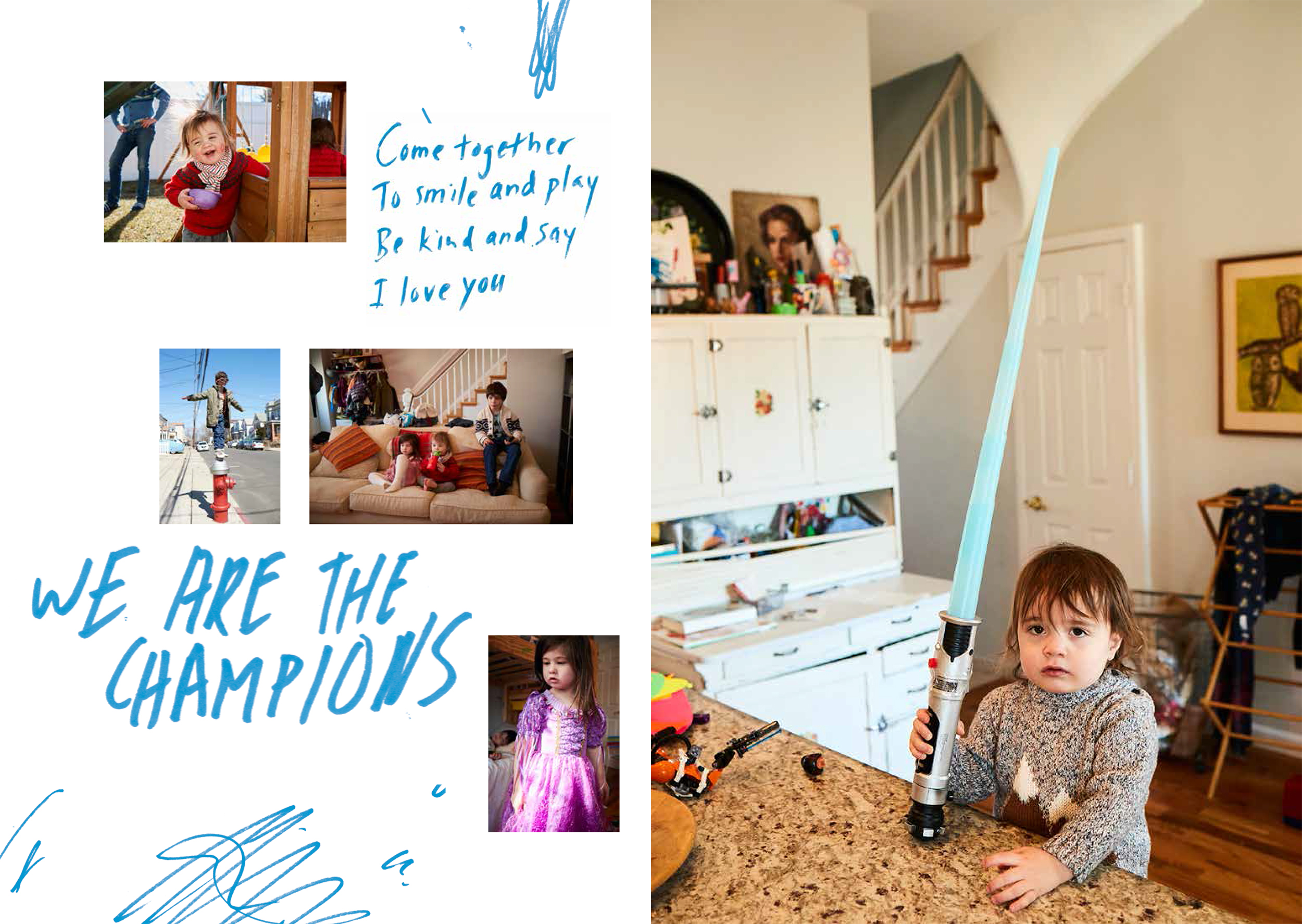
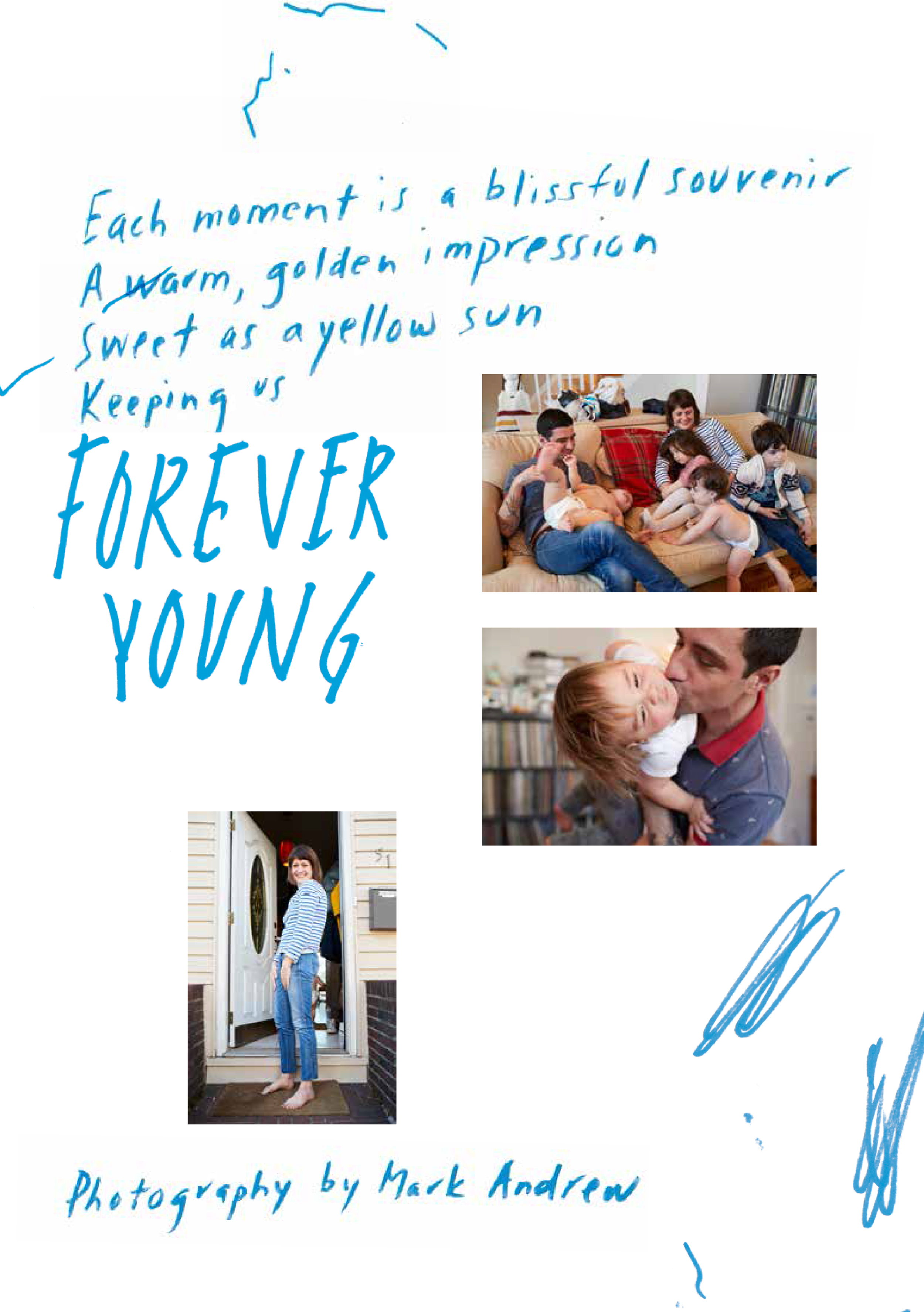
Mark Andrew asked us to create a mailer for him to promote his photography. Mark is a fantastically talented photographer and director who works in a very spontaneous and free style. In that spirit we decided to create a piece that felt like it would be at home in an indie magazine that doesn’t follow the rules.

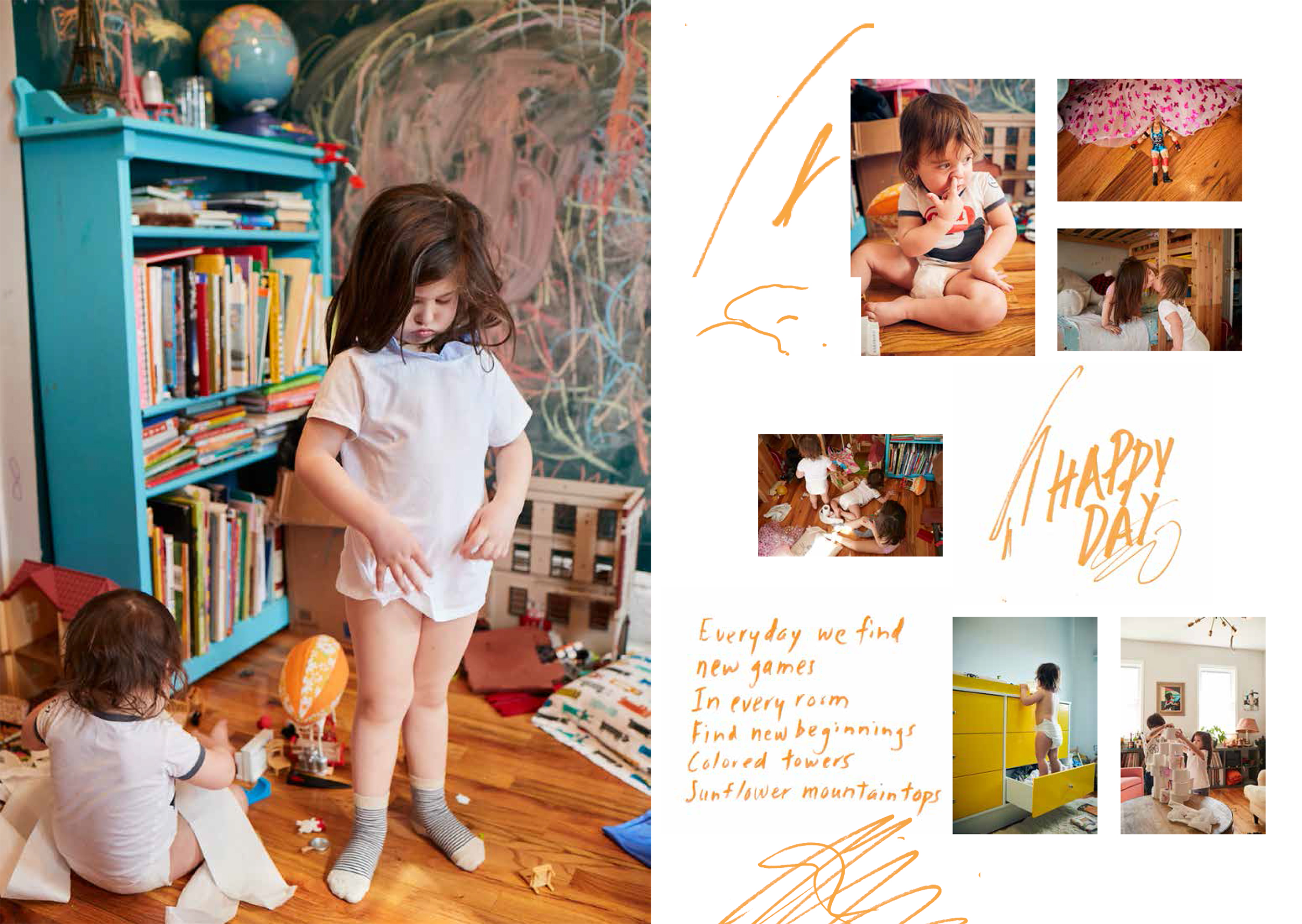
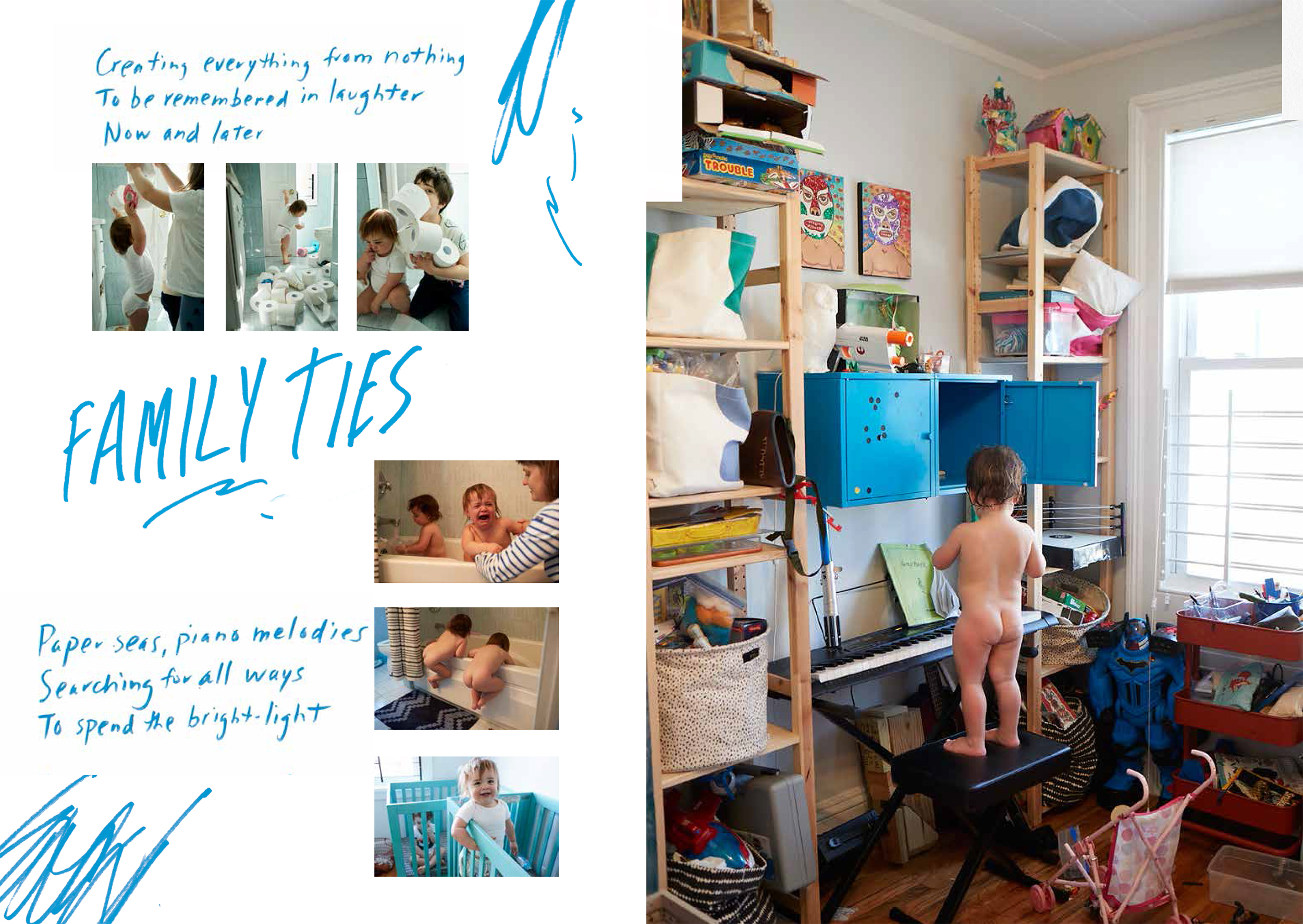
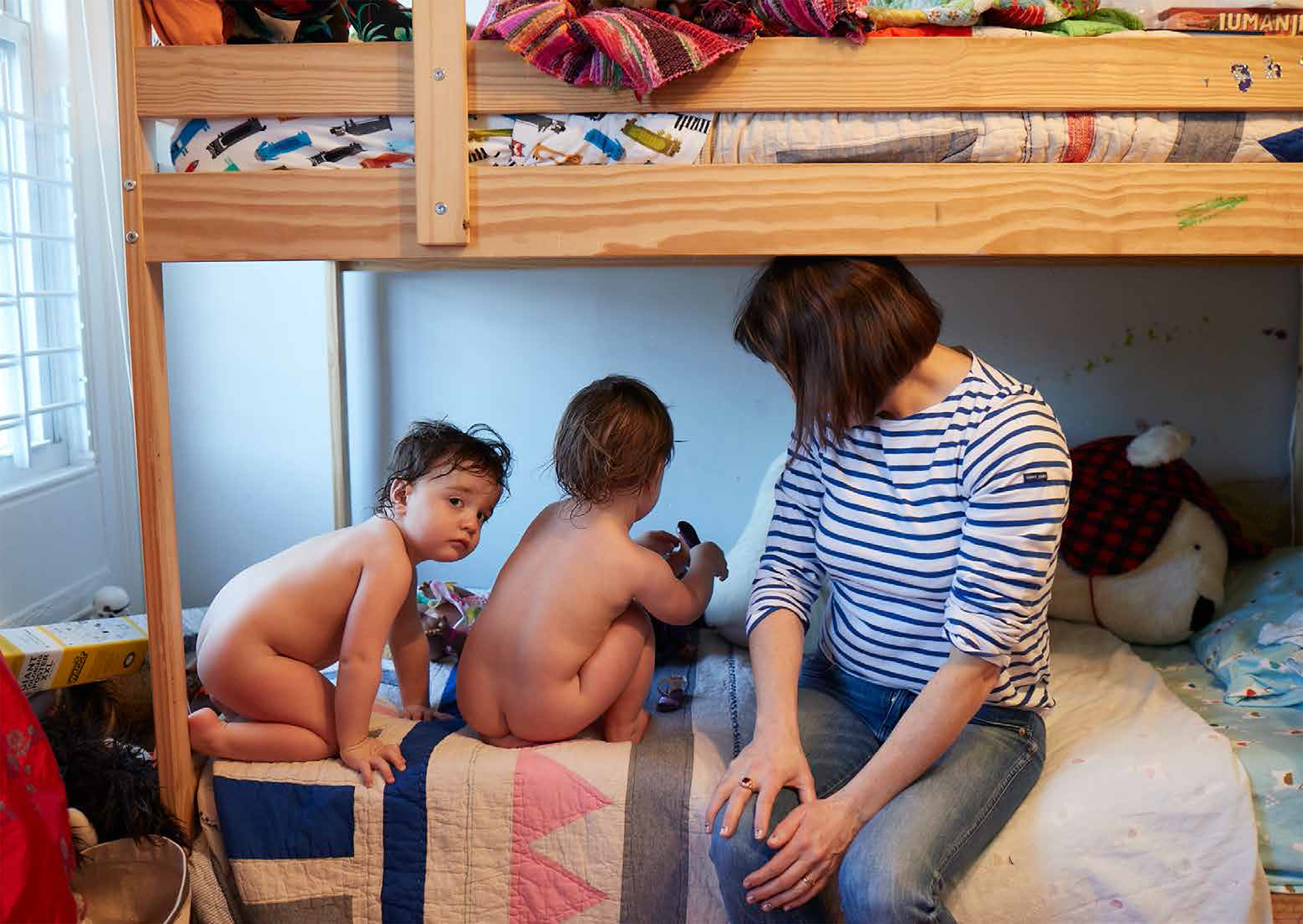
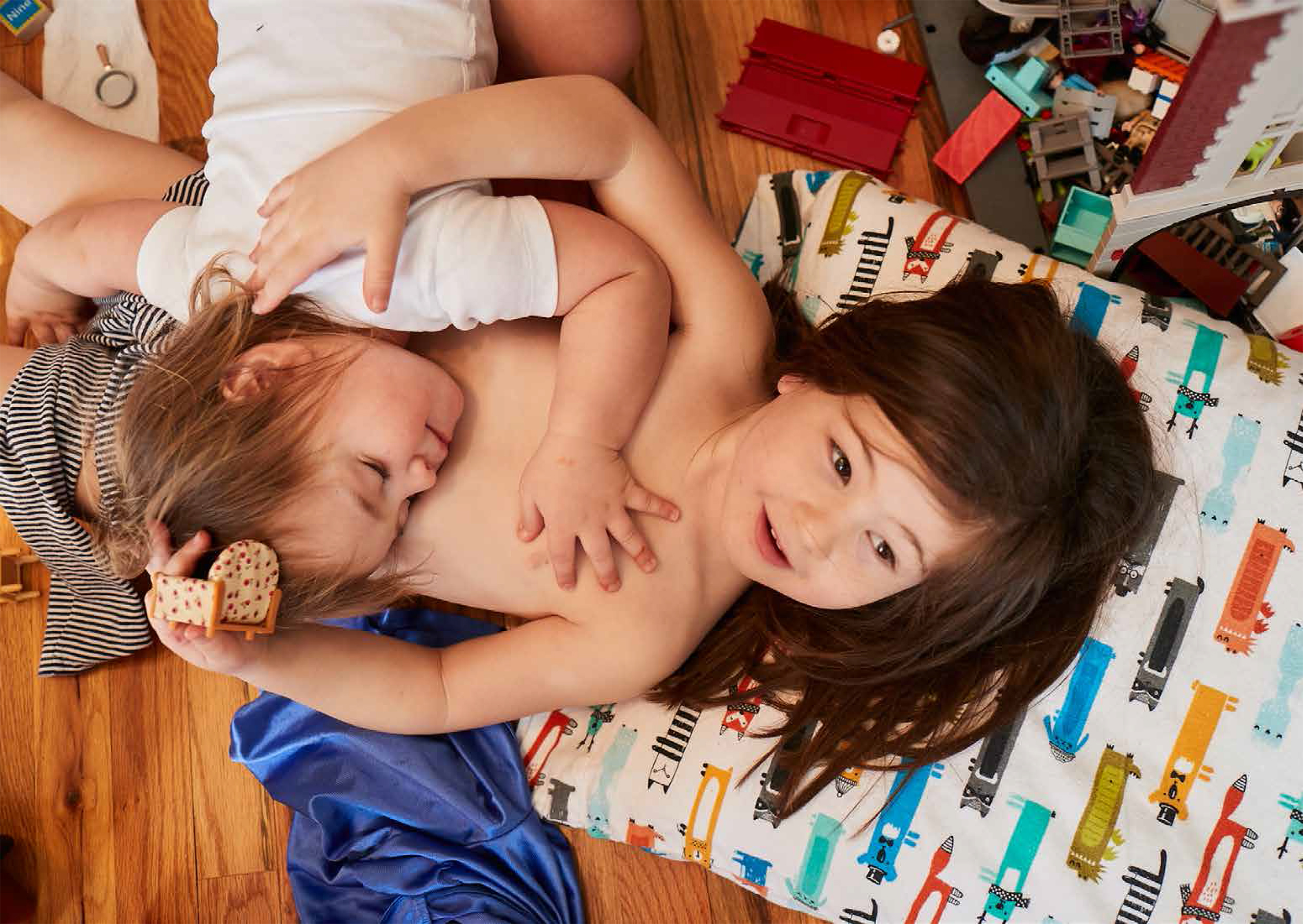
The first step was to find the images we thought would work together best. Mark gave us 124 images that we edited down to 25. The entire shoot felt like a little movie so we grouped the pictures together into scenes. Each spread is it’s own scene. In order to heighten the drama we interspersed full bleed spreads between some of the mutli-picture spreads. Pacing and scale changes are key in these types of layouts.

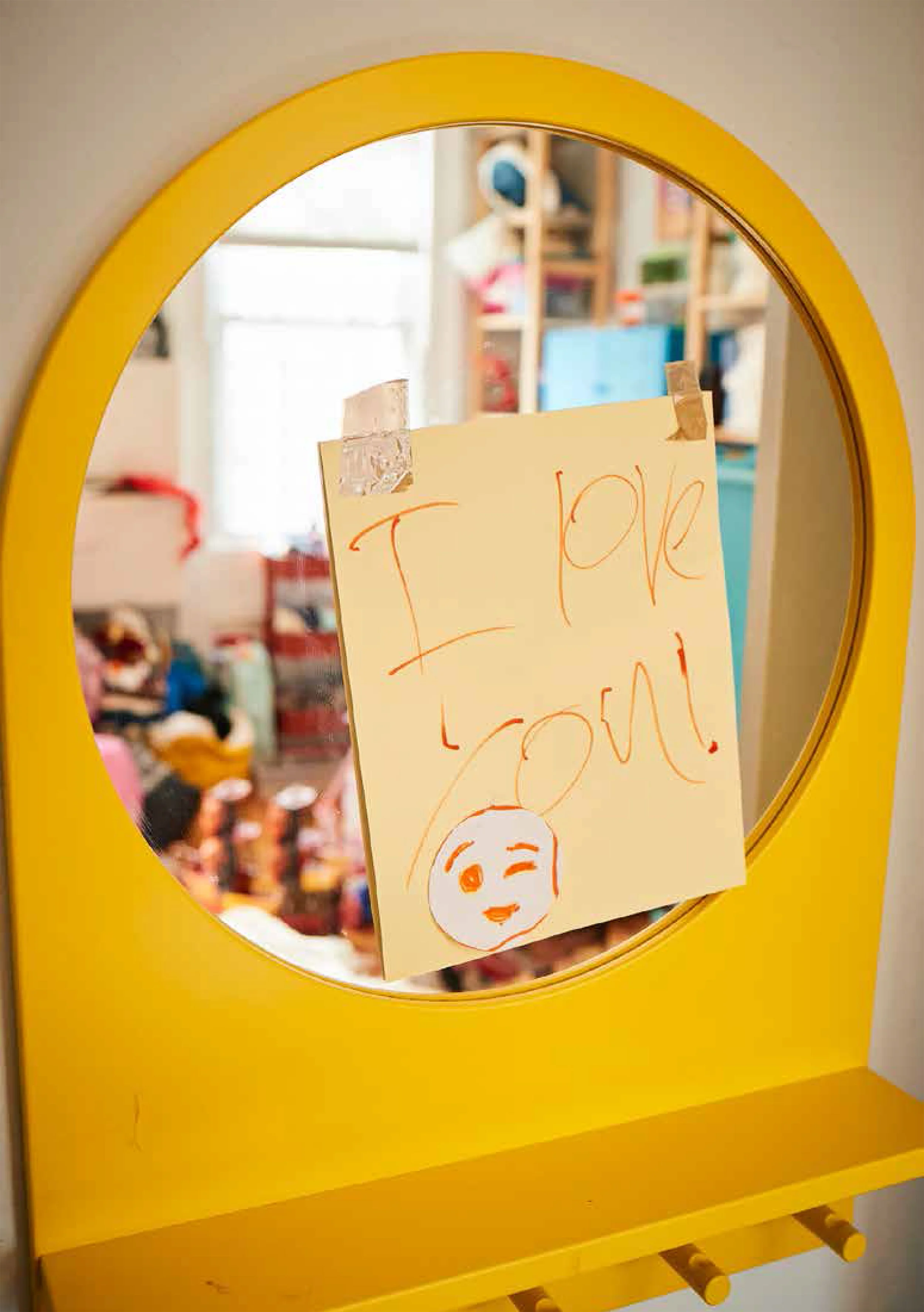
Step two was to enlist the help of our poetic art director friend and co-collaborator Katie Belloff. She wrote sweet little poems for each page and texted them to us. We wrote the headlines.
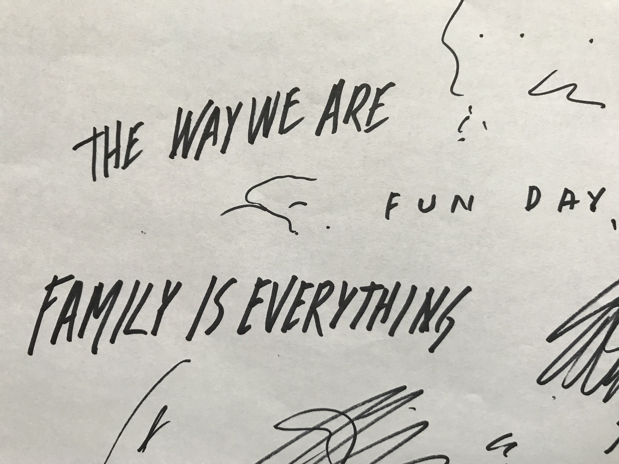
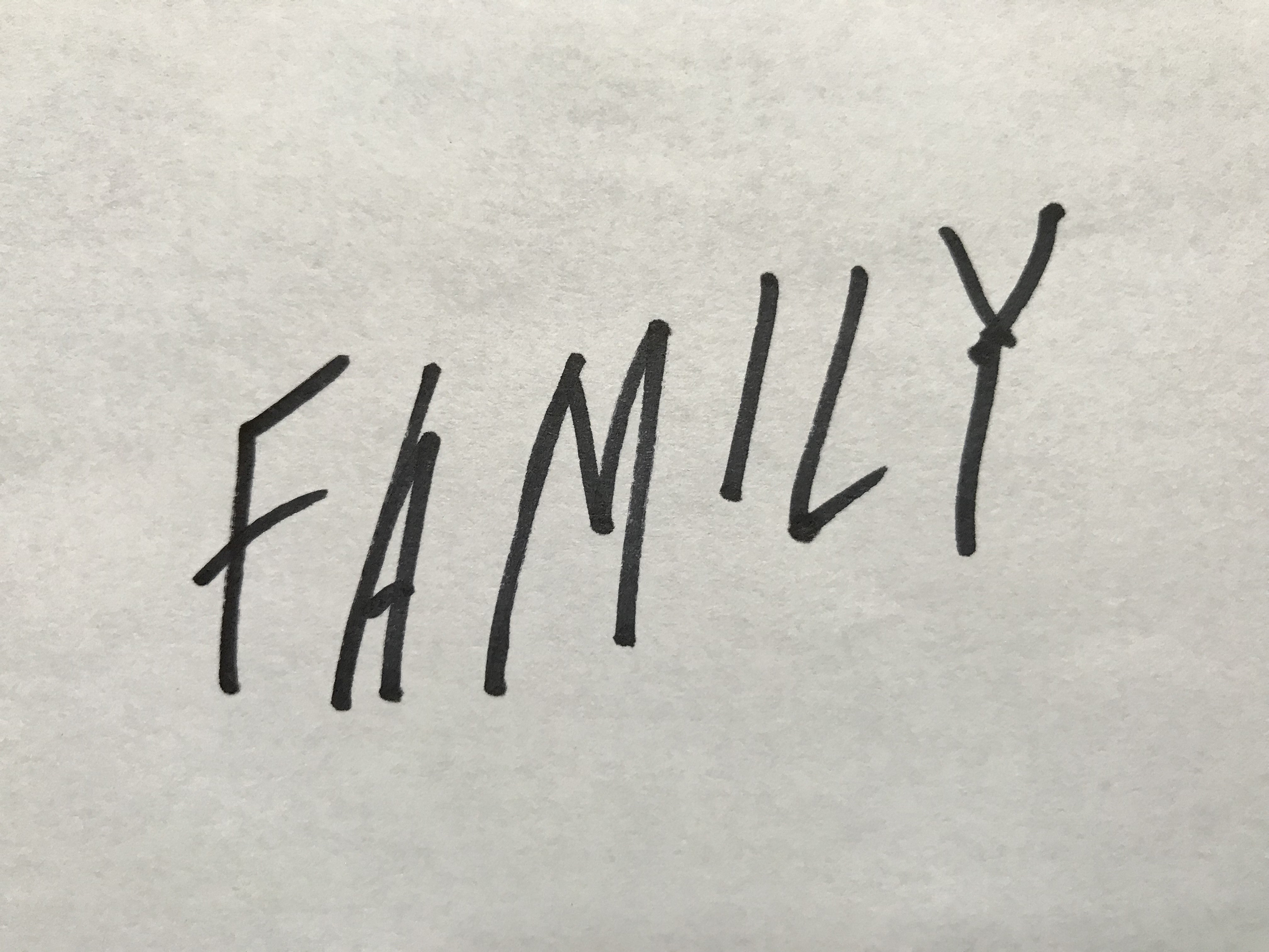
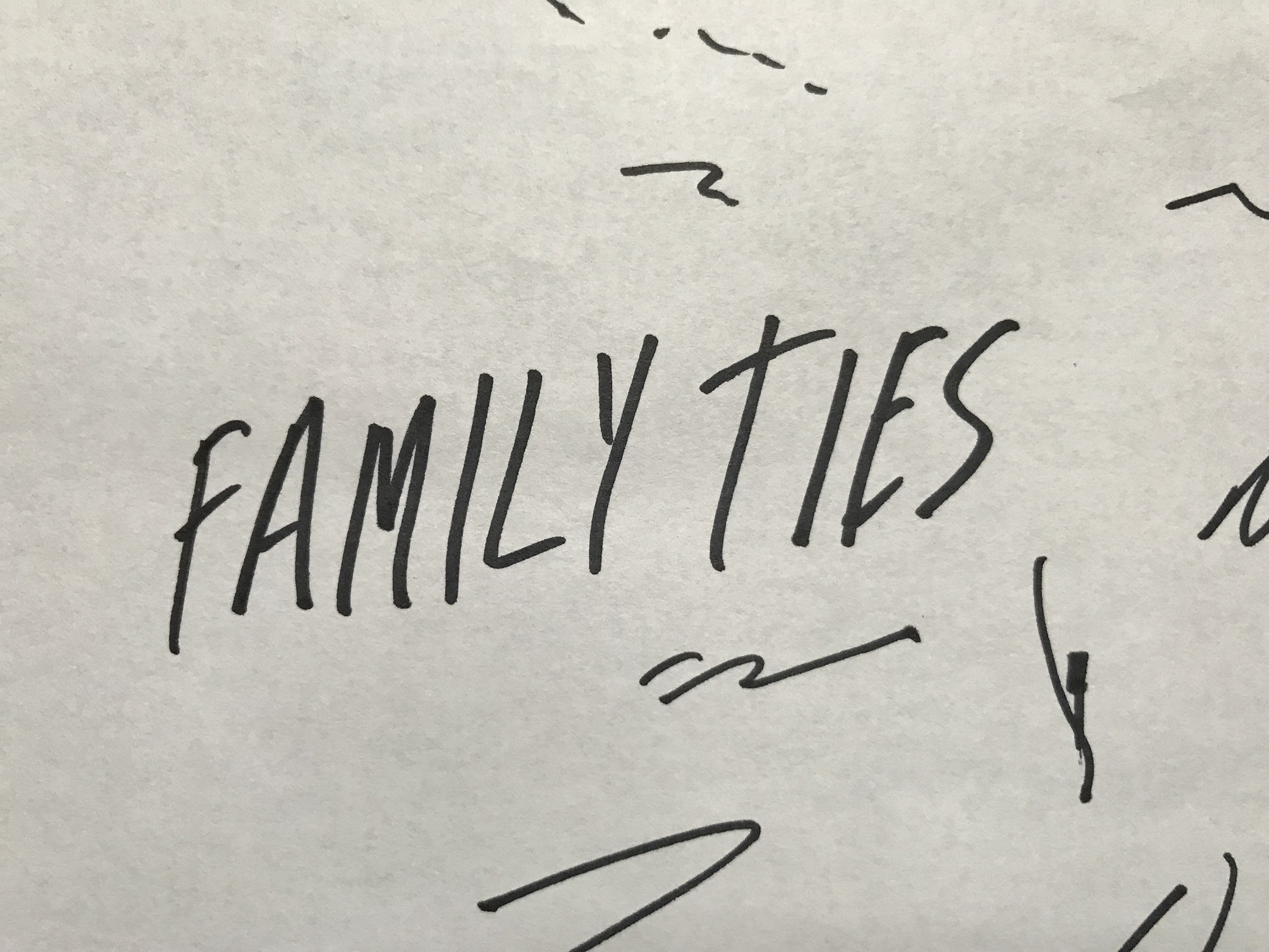
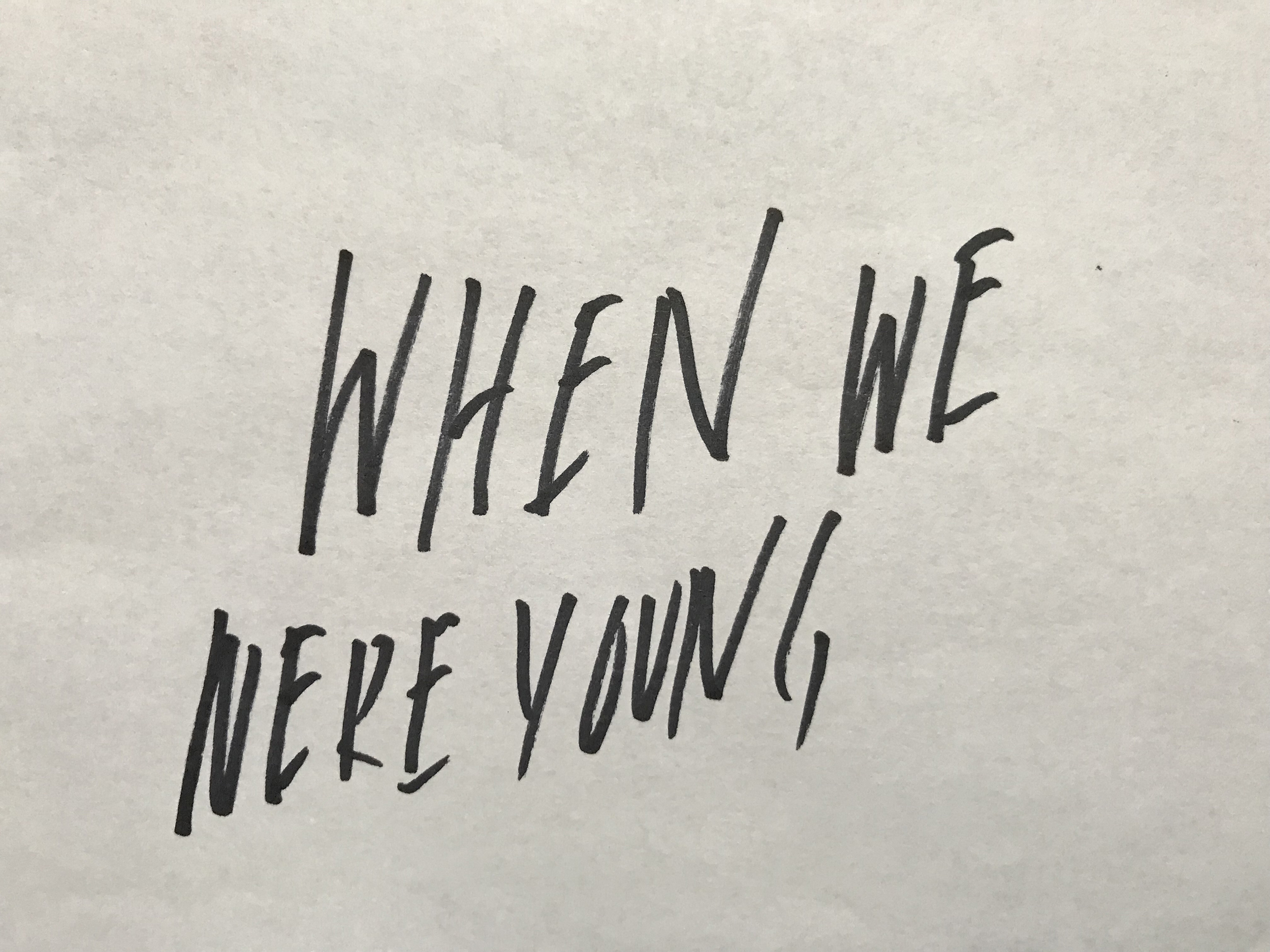
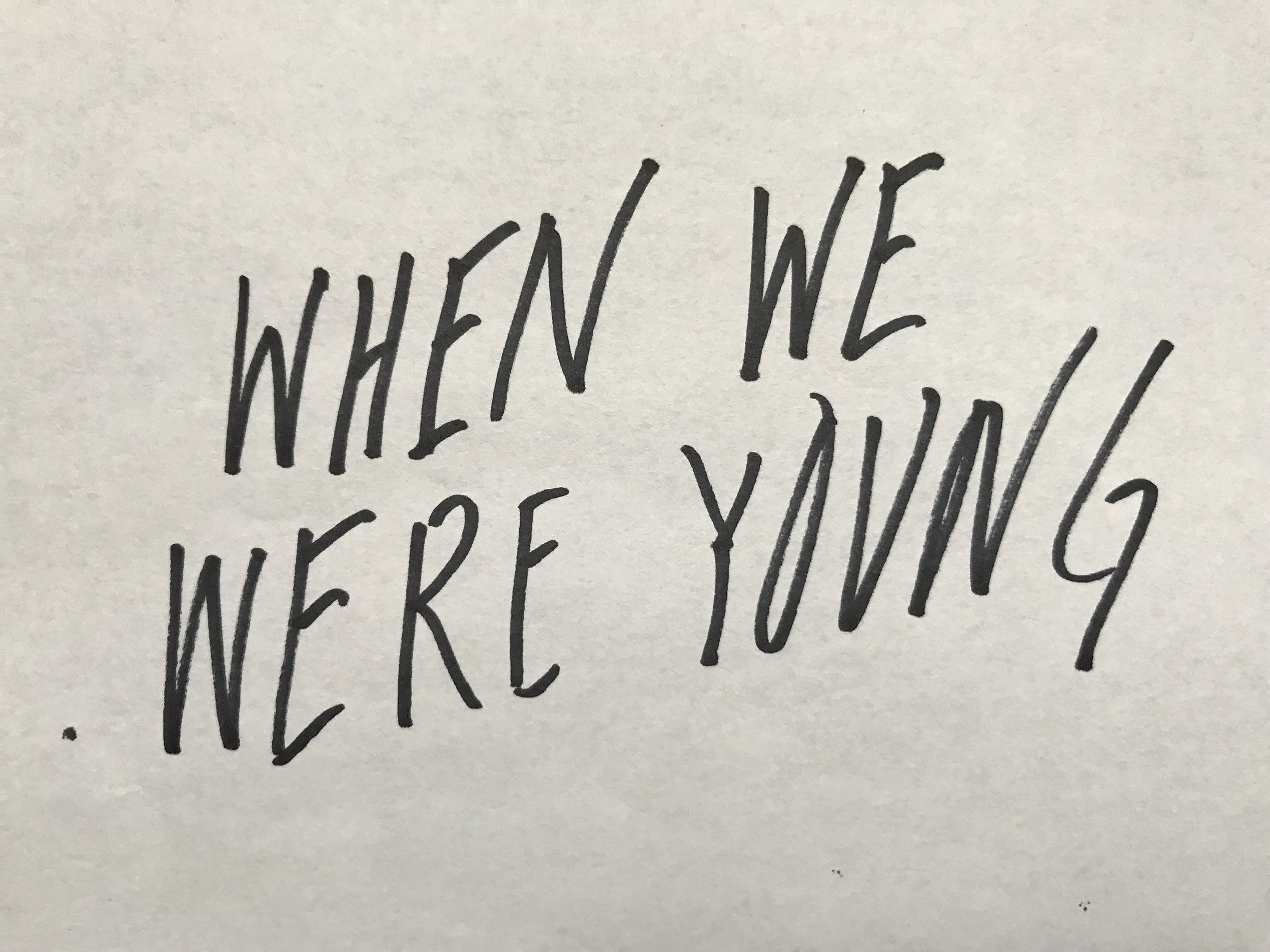
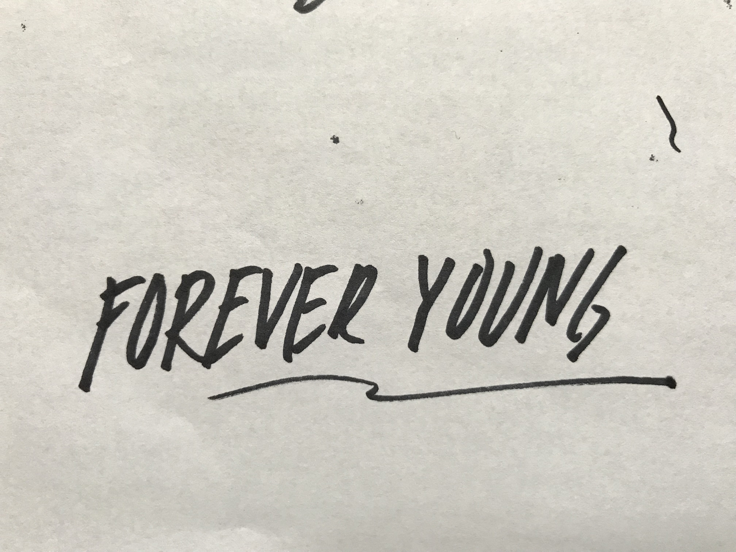
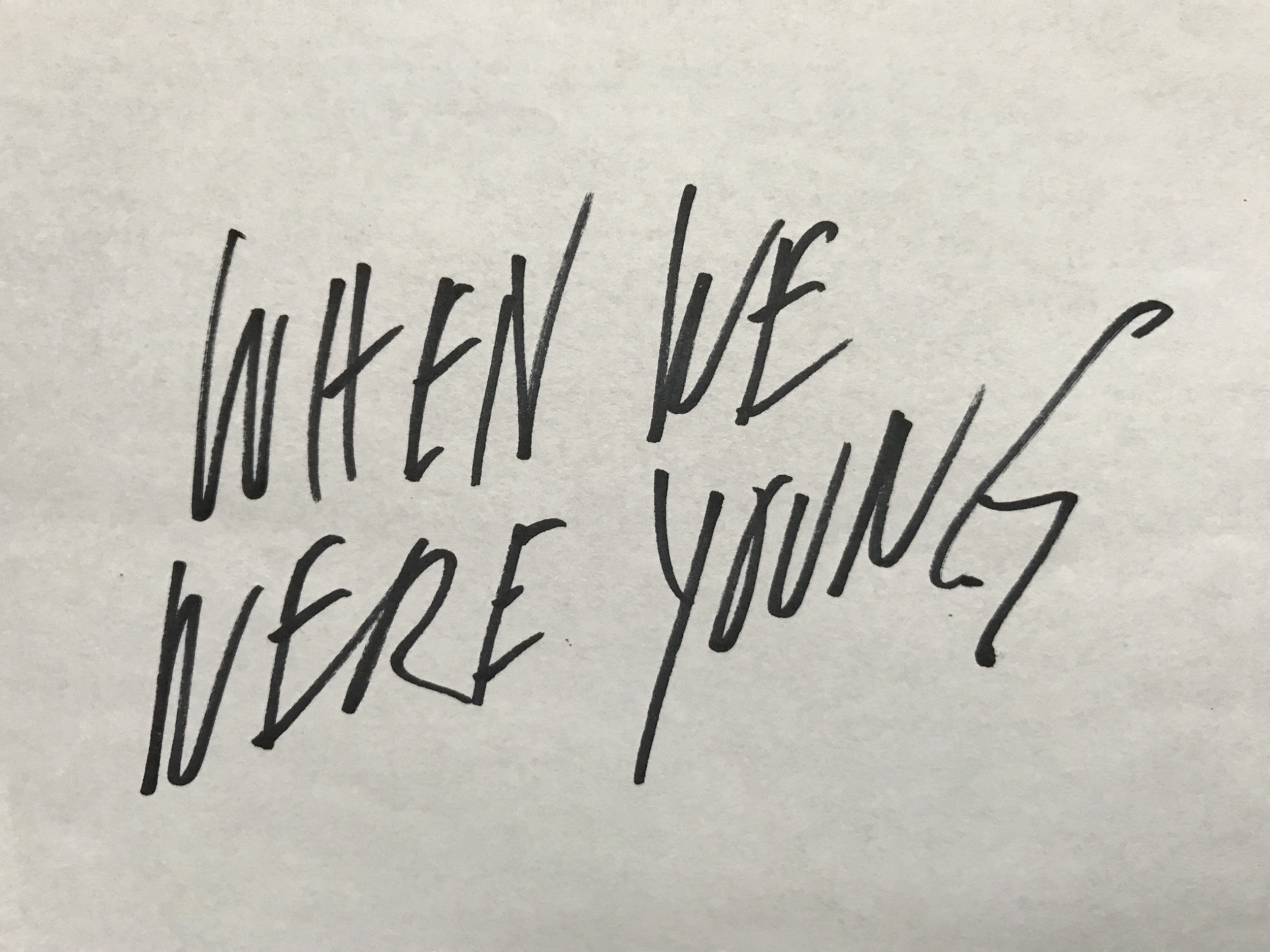
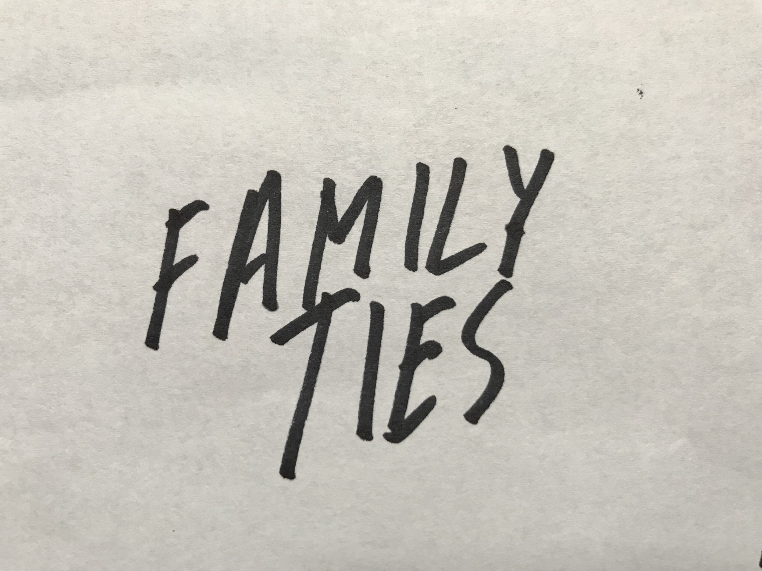
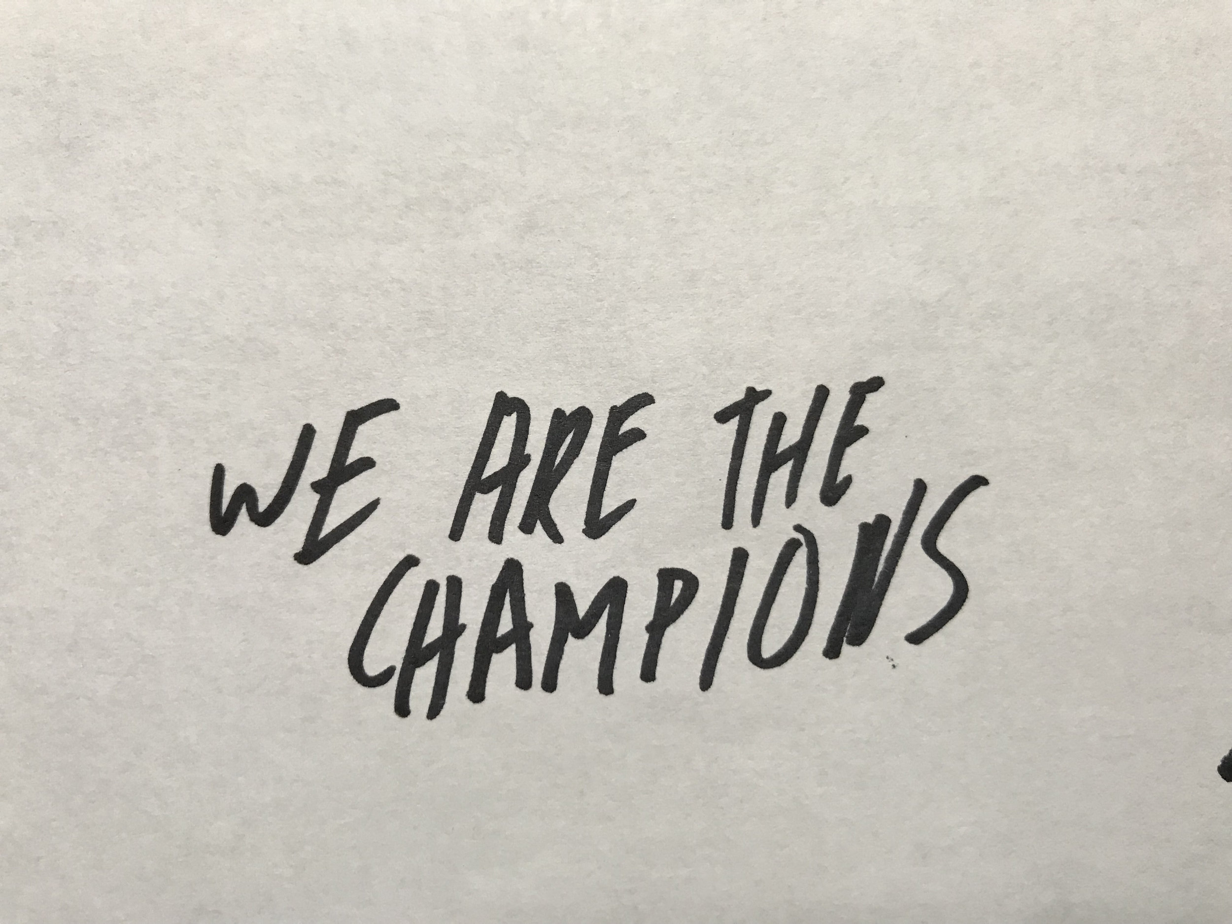
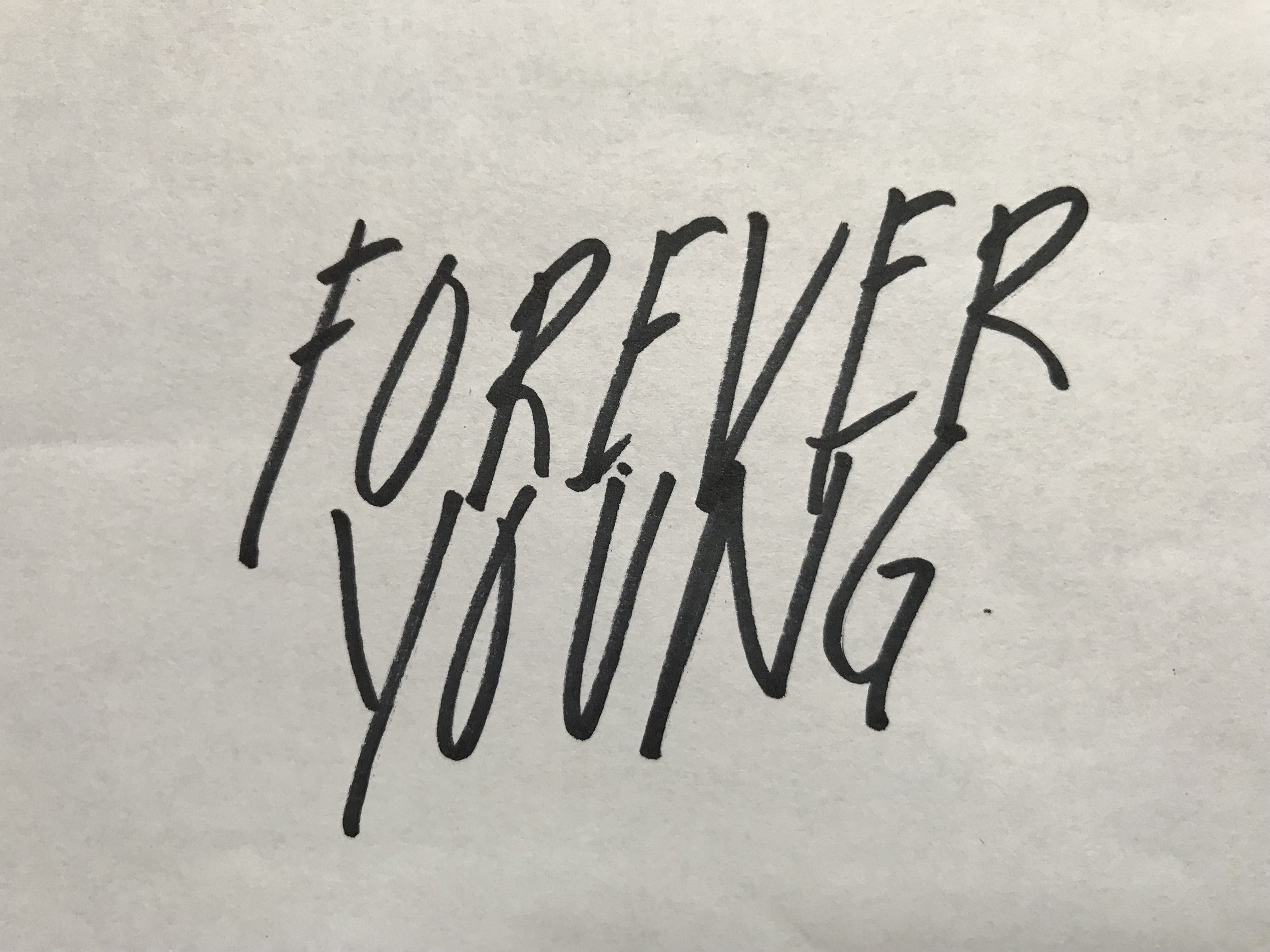
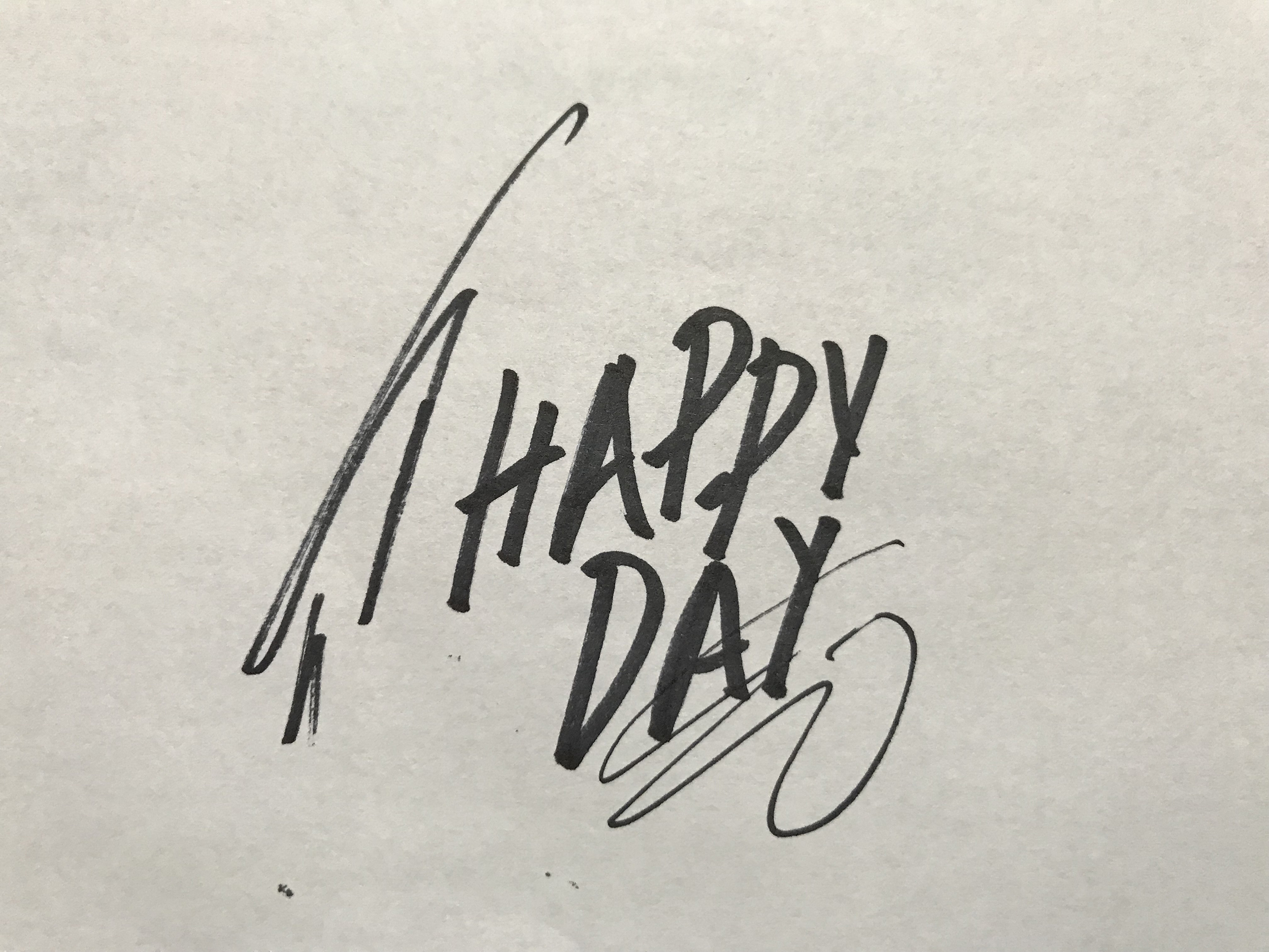
Now that we had our structure and our copy step three was to create our typography. Since Mark is all about spontaneity and moments we thought our type should reflect this feeling. All the lettering in this piece was done very quickly with a Sharpie on regular copy paper.
Our fourth and final step was to add color to our custom lettering and integrate it into our photo layout. Our color was directly inspired by the fresh and lively color in Mark’s photos. We are incredibly proud of this piece and honored that Mark asked us to work on it with him. We hope you enjoy looking at it as much as we enjoyed creating it!