Donald Partyka recently shared his deep knowledge of typography and his love of all things magazine design with our Typography II class at Kean University.
We had the pleasure of having Donald Partyka, Creative Director of America’s Quarterly, speak to our Typography II class at Kean University on the subject of his work. He is a fantastically talented visual storyteller with a deep knowledge of magazine art direction, graphic design and type design. Early in his career, Donald was a co-founder of the studio Point Five Design, where he redesigned Poets&Writers magazine and was one of the art directors of Linguafranca when it was nominated for a National Magazine Award. His work has won awards from the Society of Publication Designers, The Society of Illustrators, Communication Arts, 3x3, American Illustration, Latin American Ilustración, Latin American Fotografía, and Letter Arts Review. He is Adjunct Professor at Parsons School of Design.
Donald showed us some amazing typographic experiments he has recently been working on during his talk. Some of them where derived from the motion of the pen and some of them where more constructed, yet they all had a shimmering, otherworldly allure. Great designers always have their personal projects and areas of research going on behind the scenes and Donald is no exception.
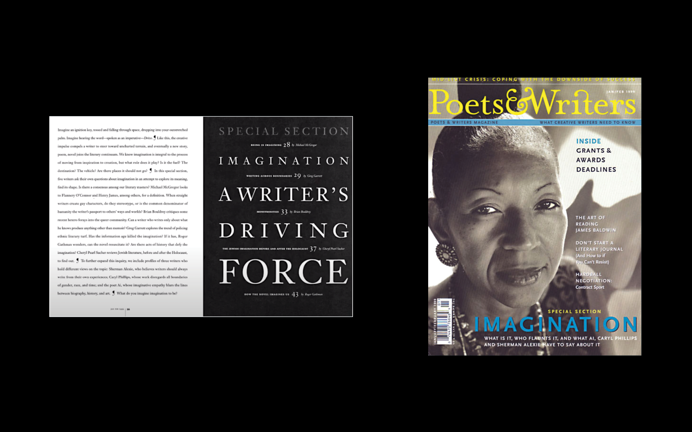
At the beginning of his talk Donald shared some spreads from Poets&Writers, a magazine he art directed early in his career. The stark beauty of the layouts are extremely striking. Many of them use an intriguing language of display typography based on typesetting itself. We always stress to our students how important mastery of typesetting is to the professional graphic designer and Donald’s work is more proof of how true that is.
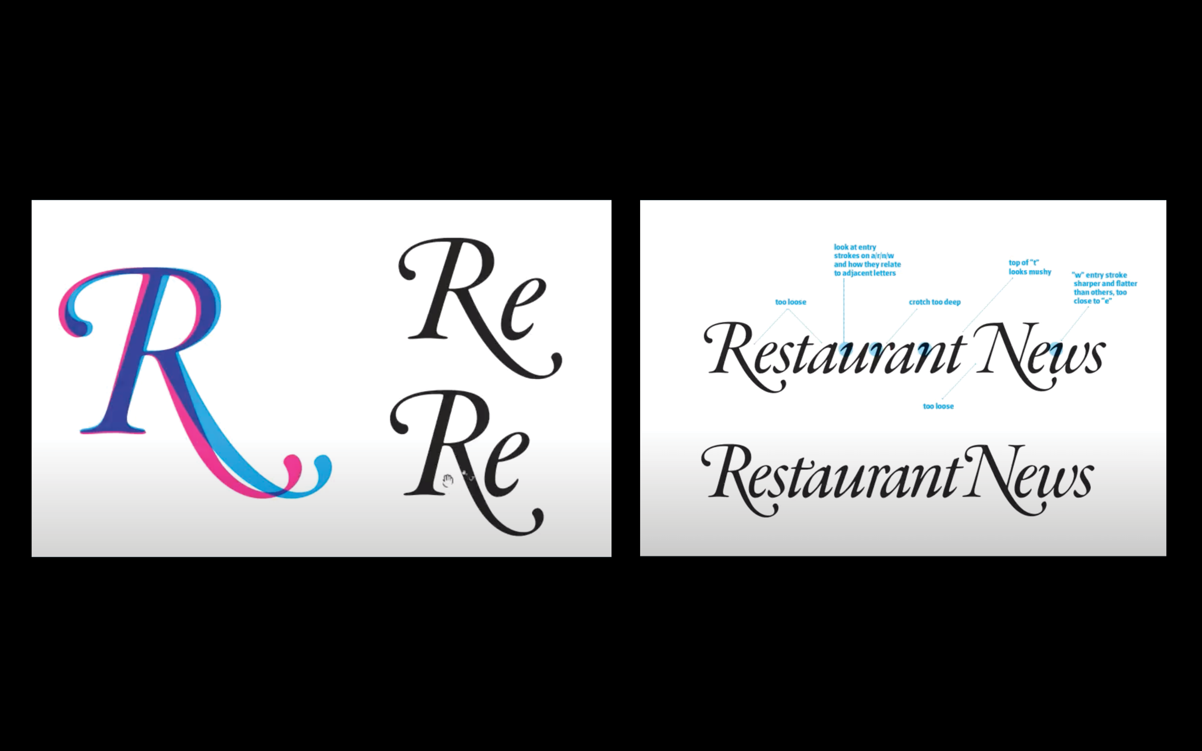
Donald works on magazines and books, but he also does custom typography and logo design. Francesca Messina recently hired Donald to breath new life into the logo of a stately old title by the name of Nation’s Restaurant News. The logotype is a thing of beauty — what designer in their right mind could resist the gorgeous swash capitals in Garamond Italic. The “R” the “N” and the “Y” set the standards for excellence in typographic expression.
The illustrious French type designer’s masterpiece of classical brilliance is just the starting point for Donald however. If you click through the carousel above there is a slide showing Donald’s working notes. These comments describe the process of modifying the individual letterforms and spaces such that they make their maximum contribution to the beauty and functionality of the composition as a whole. I find this process endlessly fascinating and I could write and think about it for hours.
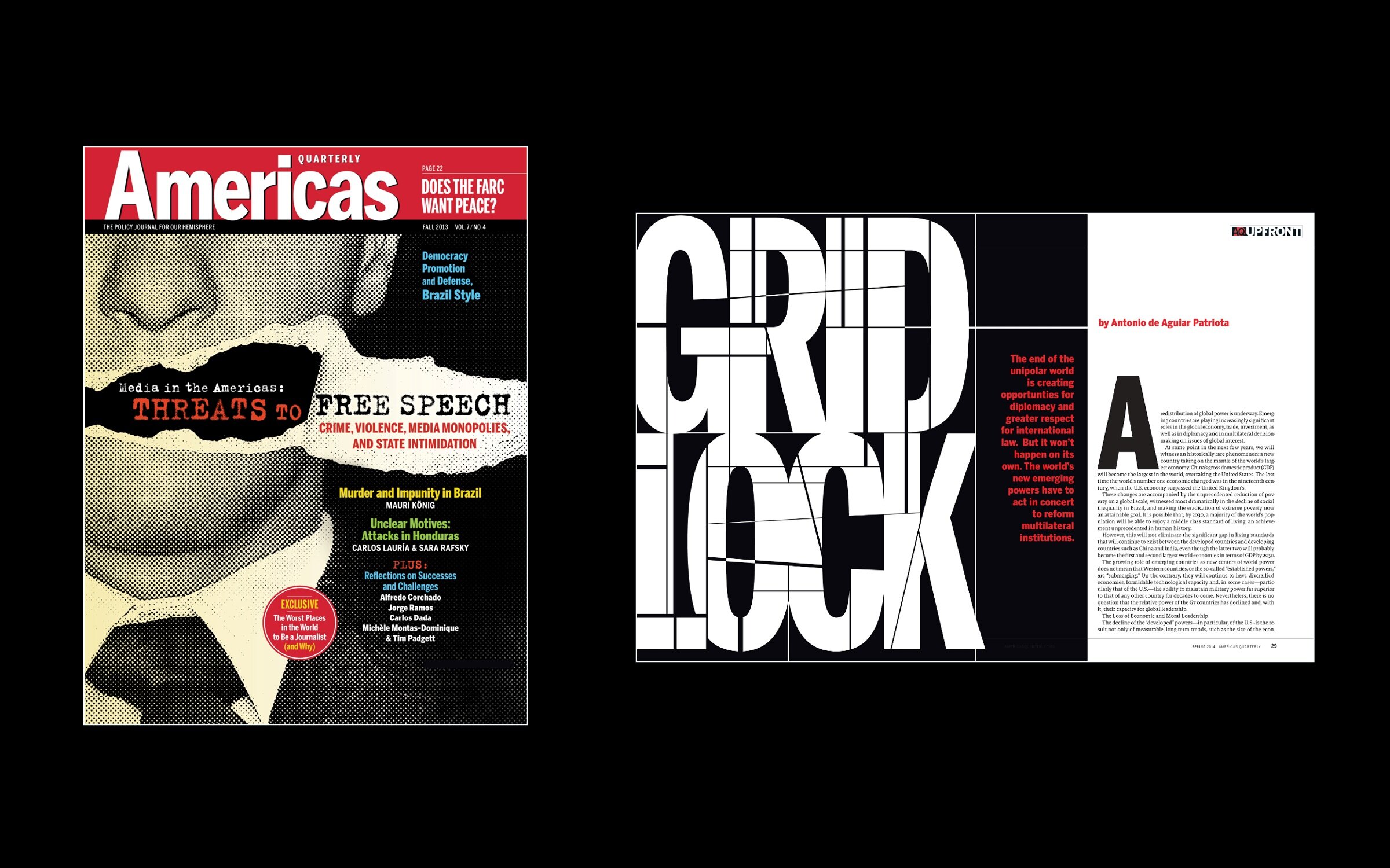
In his current role as creative director of America’s Quarterly, Donald’s mastery of commissioning illustration for editorial design, creating innovative design direction for the magazine as a whole and doing excellent display type are all on display. His gritty cover treatment for an article on free speech is particularly hard hitting, as is the mercilessly lacerated display typography in a feature about diplomatic gridlock.
It’s always a pleasure to learn from Donald and we hope to see him back in our class real soon!