"La La Land" and "Through the Looking Glass" get the gold!

McCandliss and Campbell wins fifteen awards from the Society of Publication Designers including two gold medals in design and photography.

“La La Land” gets the gold for design.

“La La Land” gets the gold for design.

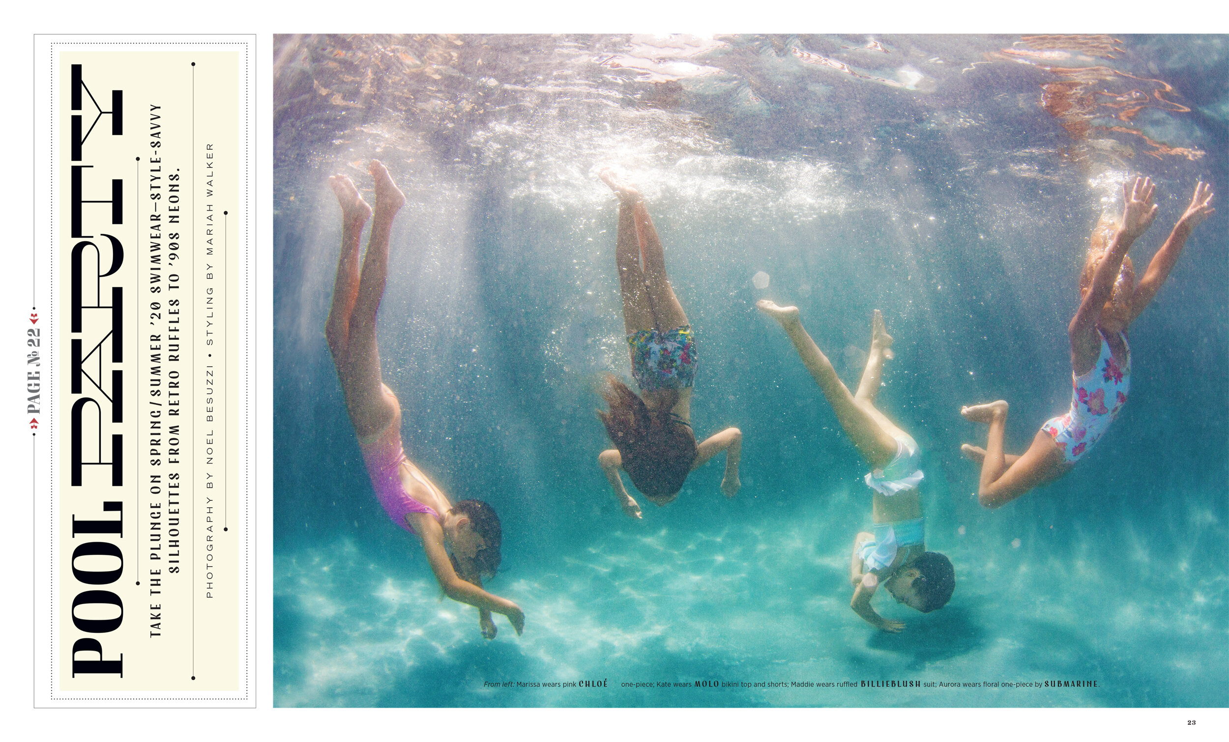
We are psyched to have won a bunch of awards in the Society of Publication Designers 55th annual competition! There was tons of amazing work this year and we are grateful to be included in the winner’s circle.

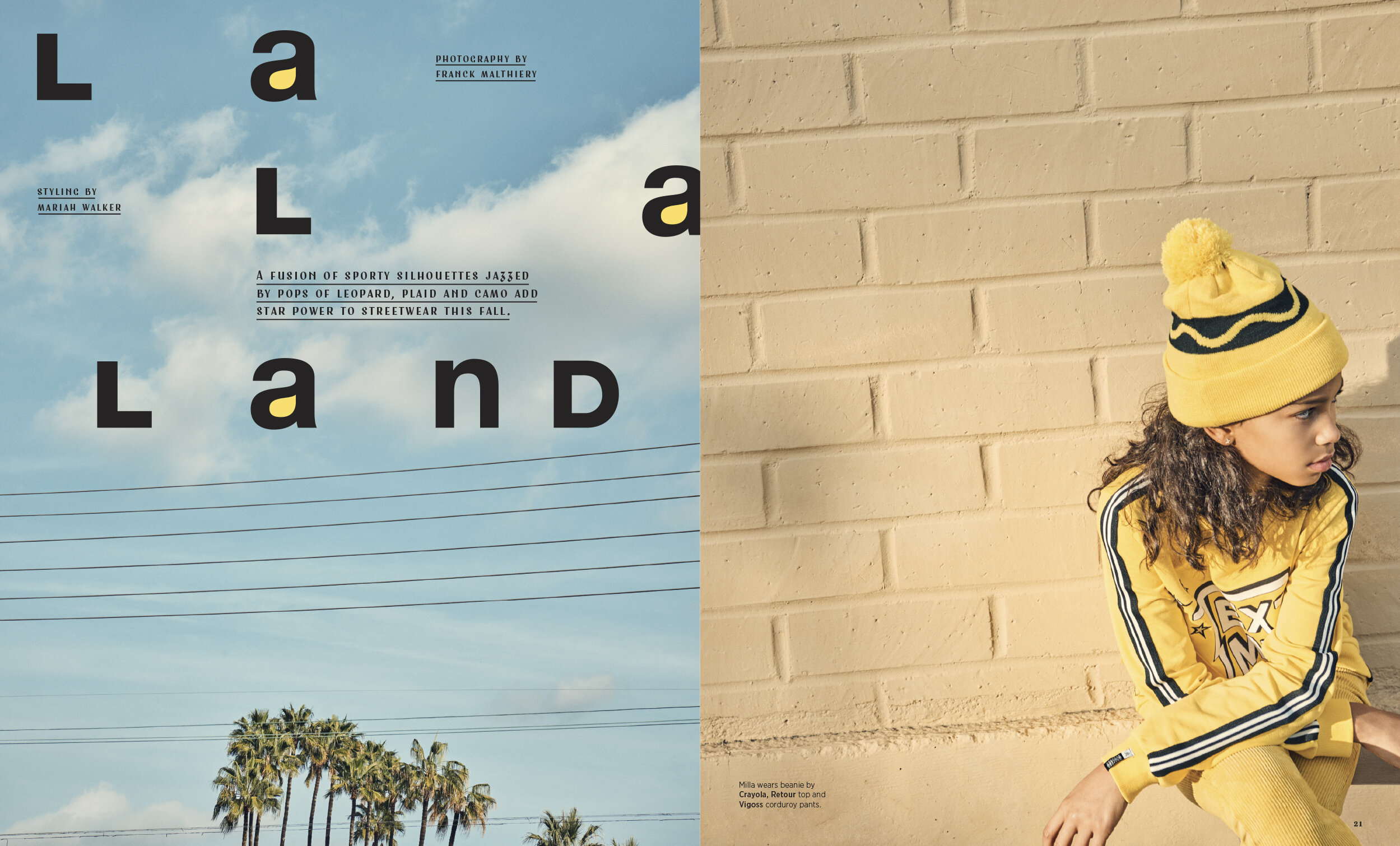
Our story “La La Land,” won a gold medal for design. Franck Malthiery shot the photos in Los Angeles with Mariah Walker styling. We were so excited when the photos came that we knew something great was happening. The story was published in the February 2019 issue of Earnshaw’s magazine.

There is something about the way that Franck is able to capture a candid moment while simultaneously creating a perfect, spare, modern composition that put us in a minimalist mood for this opener. Helvetica was the obvious foundation on which to build our design. The lowercase “a” in Helvetica bold is one of the most beautiful masterpieces in all of western typography and luckily there are three in this headline. This was one of those rare designs that came together relatively effortlessly. Once we started to flow through the spaces between the letters we found the idea of creating a graphic hook by filling in the counters of the “a”s with yellow. The dek and credits are set in one of our favorite new fonts called Fleischer by Lewis McGuffie. It has a sort of old Hollywood, 40s, brush stroke derived look that has become very popular lately.

These photographs recall images by the painters Bonnard and Vuillard whose subjects would often became intertwined with the muted floral wallpaper of a 19th century drawing room. Edges dissolve in the lilting loveliness of soft light as the distinction between foreground and background becomes irrelevant. Just as those two great painters would do in the 19th and early 20th centuries, Anna Palma transforms her subjects into a mystical vision of nature. Click the image to see the second spread.

This cover won a design and photography award. Franck’s cover is one of the very best cover’s we have ever done and an instant classic. The typography in the headline is among our best and holds a special place in my heart.

This cover won a design and photography award. Franck’s cover is one of the very best cover’s we have ever done and an instant classic. The typography in the headline is among our best and holds a special place in my heart.

european_union-1.jpg
sheer_bliss-1.jpg
19_VALKOMMEN_OPENER_YANKEE.jpg

"The Naturals" wins Communication Arts Design Award

We are honored to have won a Communication Arts Design Award for the opener to our kids fashion story “The Naturals.” The story was photographed in Ibiza, Spain by the brilliant and talented Zoe Adlersberg and styled by the equally brilliant and talented Mariah Walker. This children’s fashion story appeared in the September 2018 issue of Earnshaw’s magazine.

Read More