We will be giving a virtual presentation of our work to the students, faculty and general public at The Jackson State University School of Art and Design tonight at 7pm EST. You can sign up here. See you there!

Check out our new redesign of children's fashion title, Earnshaw's magazine
Our new photo-forward redesign, features lighter, brighter colors, super-bold slugs and a lighter copy fit.

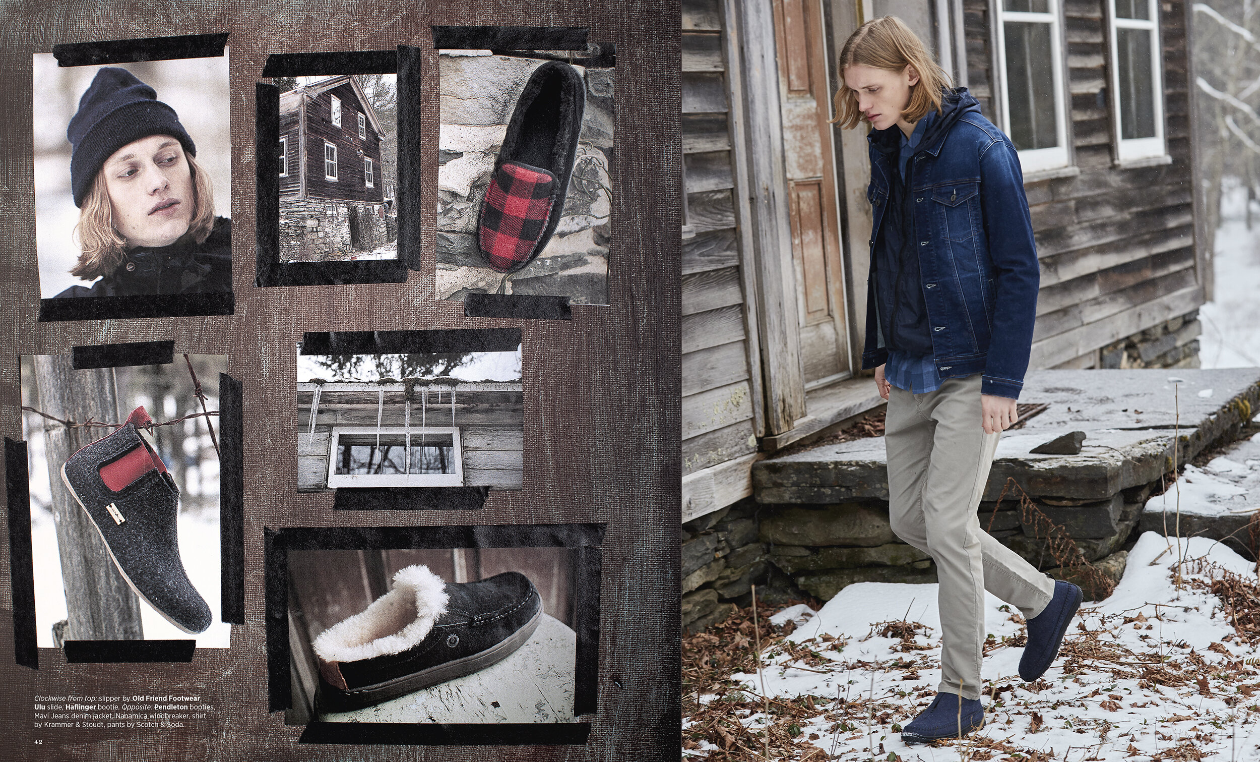
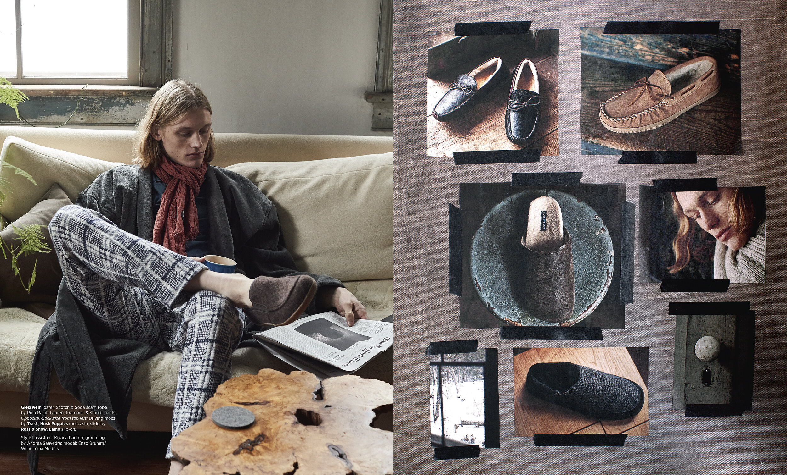
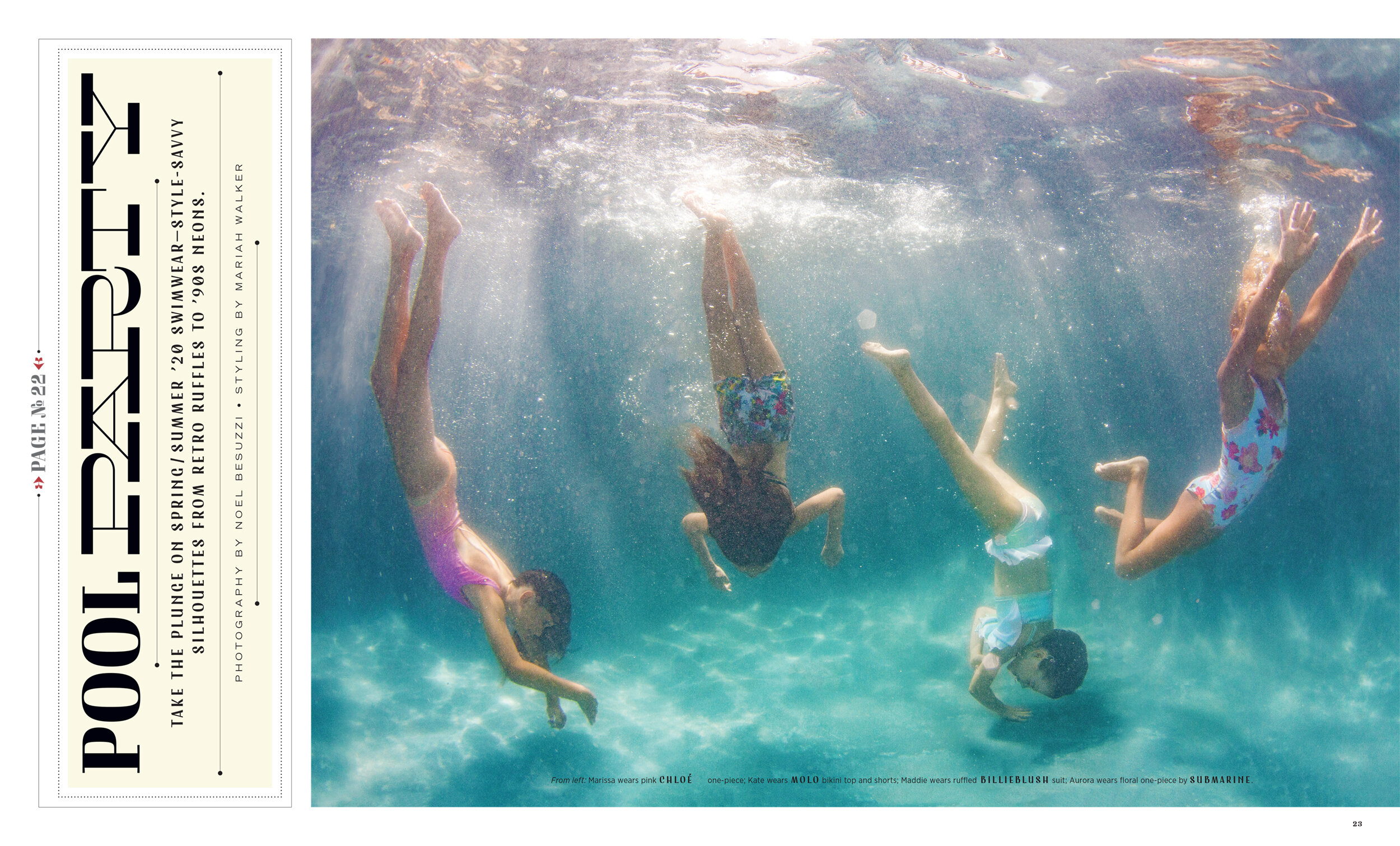
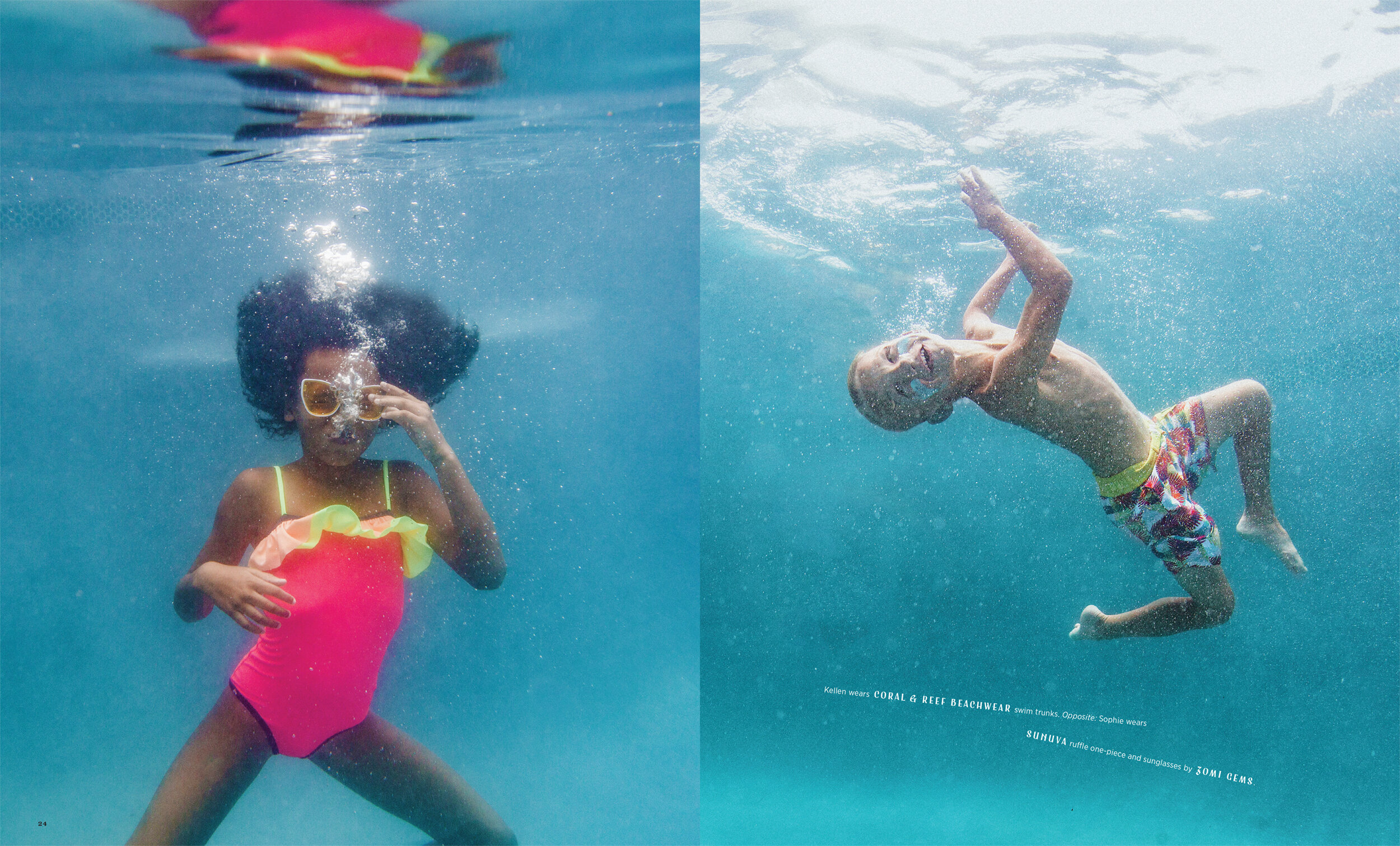
Check out a few of our favorite pages from the new Earnshaw’s magazine redesign. The new design is a bit less newsy and a bit more photo-forward. We also lightened up the colors and the copy fit. It’s kind of 1970s Kodak branding, meets Millennial pink.
The typography got a refresh too. We swapped ITC Tiffany Heavy for Oh No Fatface. Some of the new slugs are very bold, featuring a powerful new sans from Pangrampangram called Monument Extended. We included a new favorite reverse contrast sans called Antipole by Roland Hörmann. Cooper Black was added, but kept Hoefler&Co.’s masterpiece Chronicle.
In these changing times like these, a big, bold change seemed like the right move. We hope you like it!
The Real Donald
Donald Partyka recently shared his deep knowledge of typography and his love of all things magazine design with our Typography II class at Kean University.
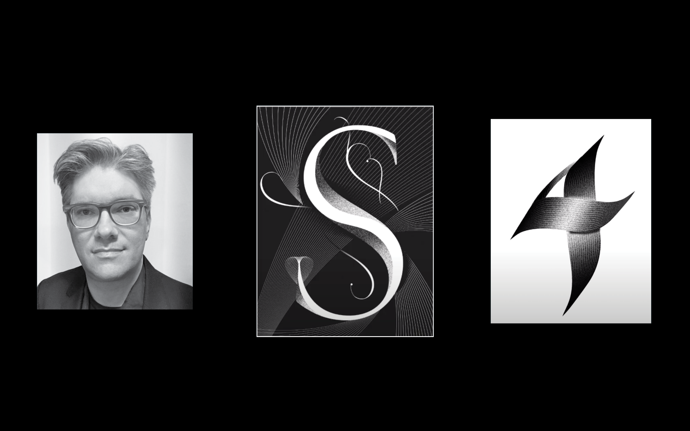
We had the pleasure of having Donald Partyka, Creative Director of America’s Quarterly, speak to our Typography II class at Kean University on the subject of his work. He is a fantastically talented visual storyteller with a deep knowledge of magazine art direction, graphic design and type design. Early in his career, Donald was a co-founder of the studio Point Five Design, where he redesigned Poets&Writers magazine and was one of the art directors of Linguafranca when it was nominated for a National Magazine Award. His work has won awards from the Society of Publication Designers, The Society of Illustrators, Communication Arts, 3x3, American Illustration, Latin American Ilustración, Latin American Fotografía, and Letter Arts Review. He is Adjunct Professor at Parsons School of Design.
Donald showed us some amazing typographic experiments he has recently been working on during his talk. Some of them where derived from the motion of the pen and some of them where more constructed, yet they all had a shimmering, otherworldly allure. Great designers always have their personal projects and areas of research going on behind the scenes and Donald is no exception.
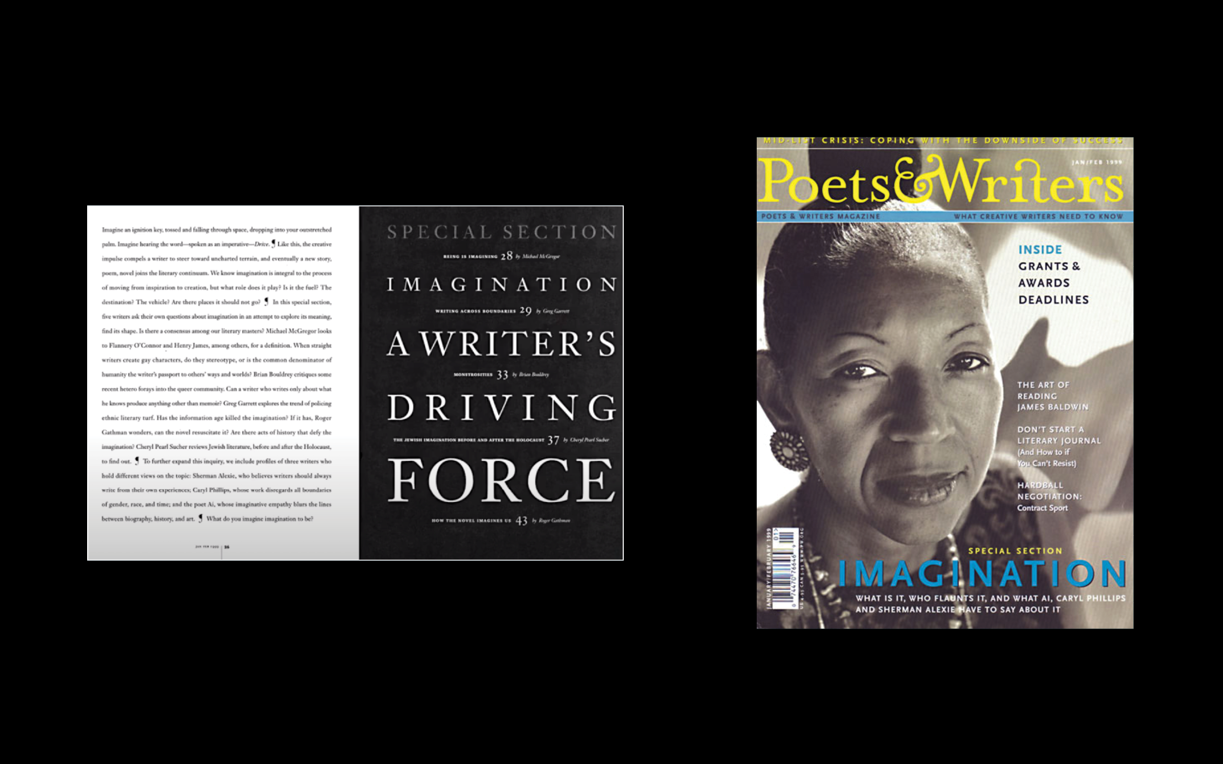
At the beginning of his talk Donald shared some spreads from Poets&Writers, a magazine he art directed early in his career. The stark beauty of the layouts are extremely striking. Many of them use an intriguing language of display typography based on typesetting itself. We always stress to our students how important mastery of typesetting is to the professional graphic designer and Donald’s work is more proof of how true that is.
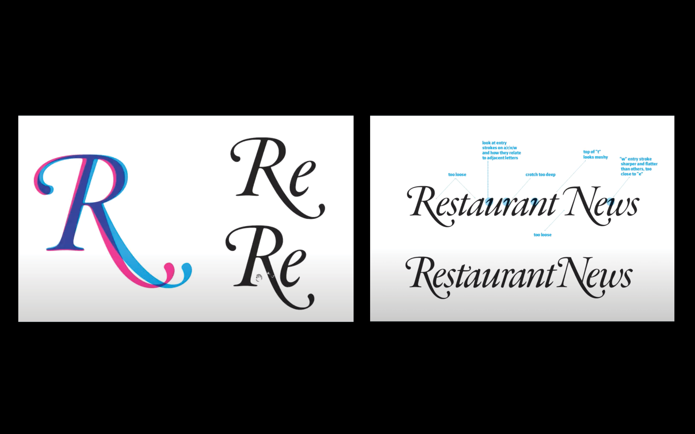
Donald works on magazines and books, but he also does custom typography and logo design. Francesca Messina recently hired Donald to breath new life into the logo of a stately old title by the name of Nation’s Restaurant News. The logotype is a thing of beauty — what designer in their right mind could resist the gorgeous swash capitals in Garamond Italic. The “R” the “N” and the “Y” set the standards for excellence in typographic expression.
The illustrious French type designer’s masterpiece of classical brilliance is just the starting point for Donald however. If you click through the carousel above there is a slide showing Donald’s working notes. These comments describe the process of modifying the individual letterforms and spaces such that they make their maximum contribution to the beauty and functionality of the composition as a whole. I find this process endlessly fascinating and I could write and think about it for hours.
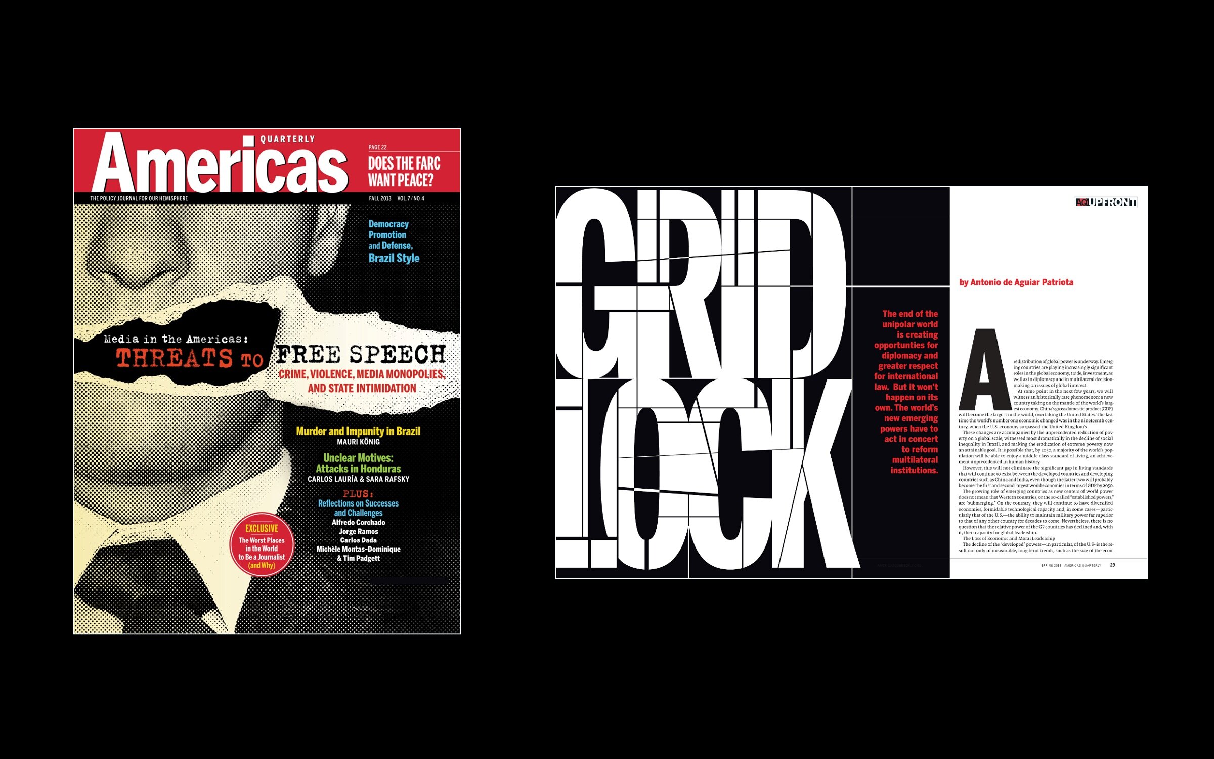
In his current role as creative director of America’s Quarterly, Donald’s mastery of commissioning illustration for editorial design, creating innovative design direction for the magazine as a whole and doing excellent display type are all on display. His gritty cover treatment for an article on free speech is particularly hard hitting, as is the mercilessly lacerated display typography in a feature about diplomatic gridlock.
It’s always a pleasure to learn from Donald and we hope to see him back in our class real soon!
Trevett McCandliss to Judge 2021 Graphis Photography Contest

Trevett McCandliss was tapped to judge the Graphis Photography Contest this year! McCandliss and Campbell have won three platinum awards from Graphis for Gentlemen, Western Stars and Mod Moves. Can’t wait to see this year’s brilliant work!
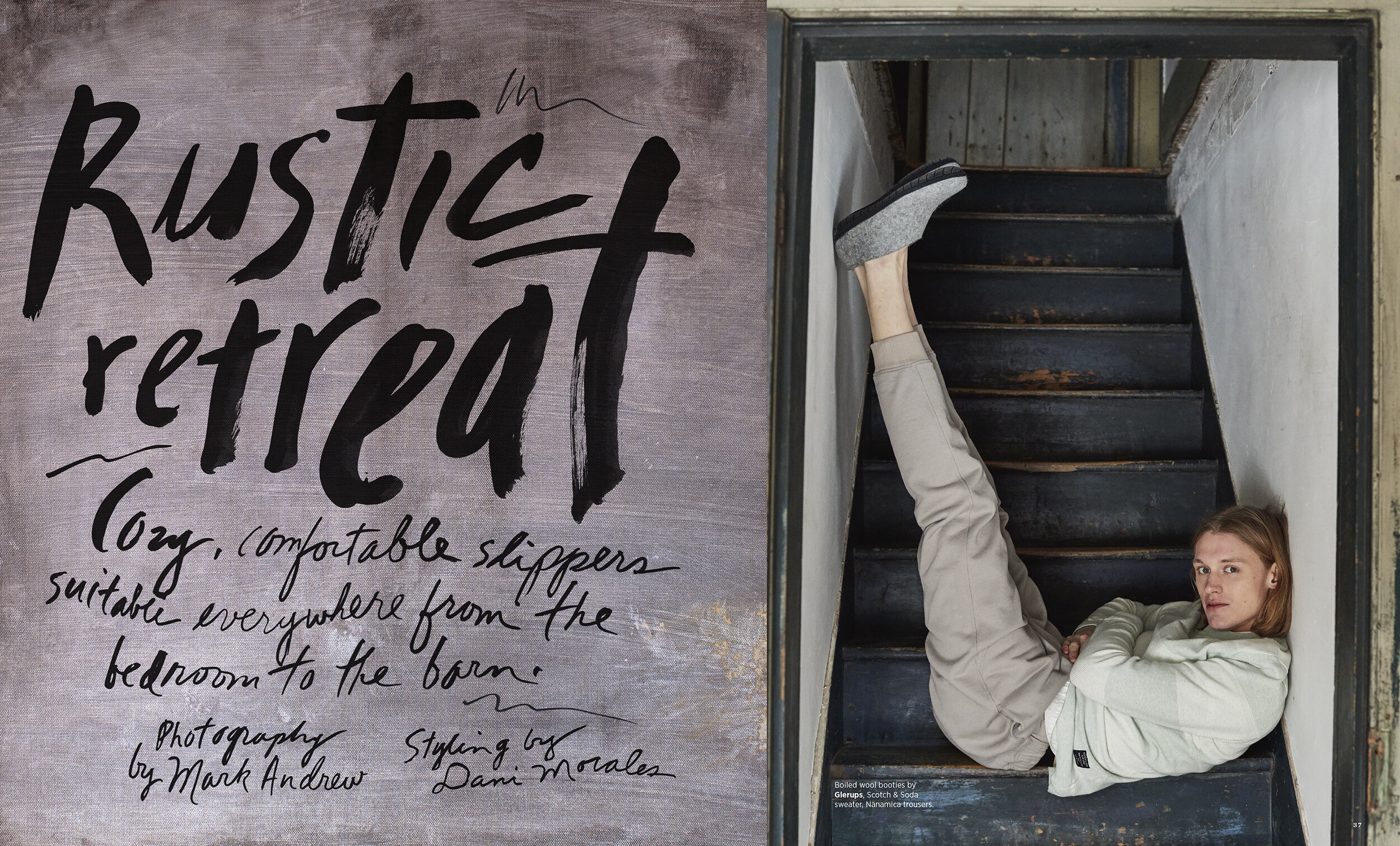
Virus Diaries
We used expressive, brushy type and a casual, collage style to create the visual mood for this intimate portrayal.
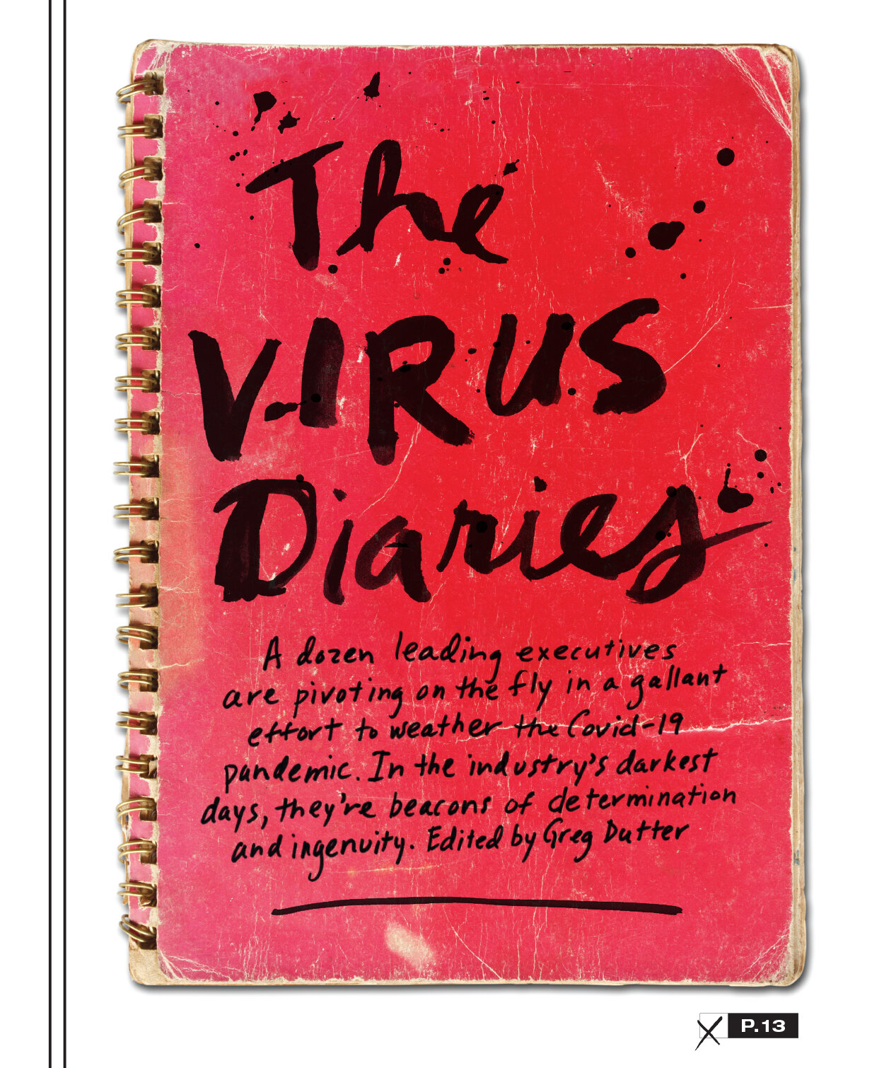
A gritty, no nonsense time in our world’s history calls for a gritty, no nonsense visual approach to the stories we tell. In the best of times we love grungy splattered handwriting. It feels like the passionate cry of the human soul, at once joyful and melancholy. Sometimes this feel takes on a special resonance and we are in one of those times. This is our love letter to everyone who is hanging in there and giving it all they’ve got!
Who the F*ck Did That?
Click the gif below to check us out on the the Society of Publication Designers’ podcast “Who the F*ck Did That?” We go behind the scenes and talk about our influences and process.

"La La Land" and "Through the Looking Glass" get the gold!
McCandliss and Campbell wins fifteen awards from the Society of Publication Designers including two gold medals in design and photography.
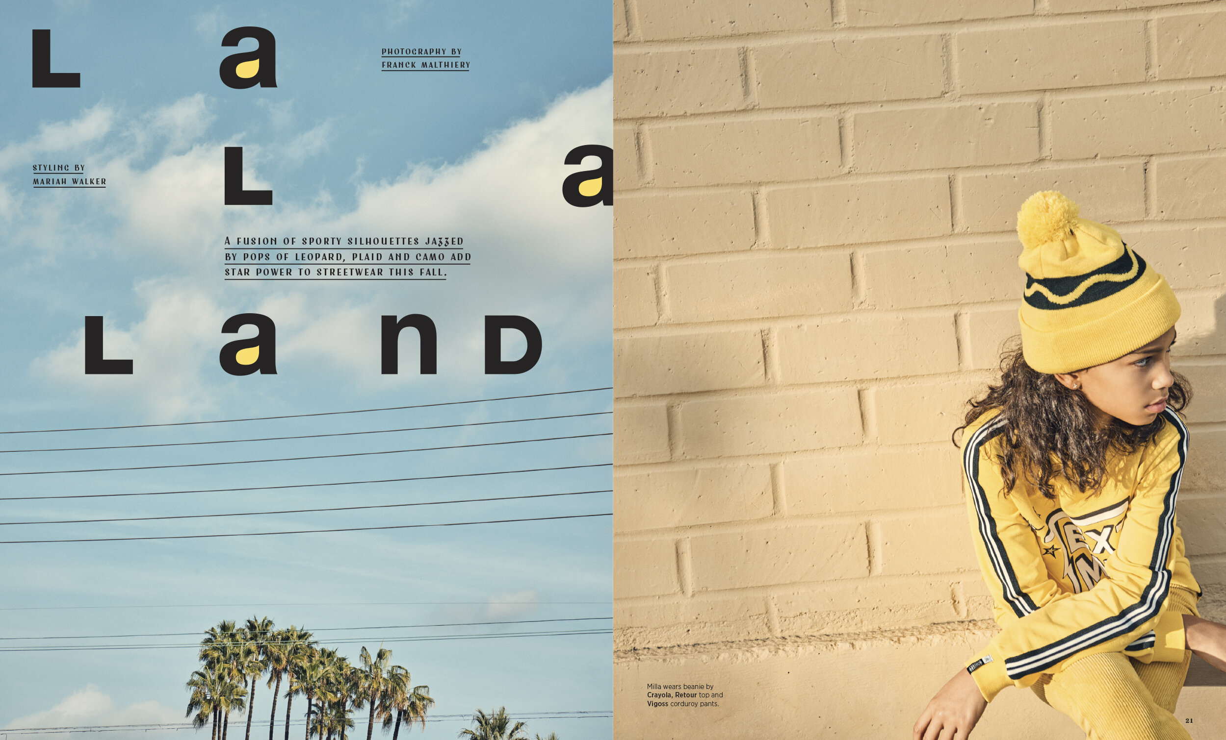
“La La Land” gets the gold for design.
We are psyched to have won a bunch of awards in the Society of Publication Designers 55th annual competition! There was tons of amazing work this year and we are grateful to be included in the winner’s circle.
Our story “La La Land,” won a gold medal for design. Franck Malthiery shot the photos in Los Angeles with Mariah Walker styling. We were so excited when the photos came that we knew something great was happening. The story was published in the February 2019 issue of Earnshaw’s magazine.
There is something about the way that Franck is able to capture a candid moment while simultaneously creating a perfect, spare, modern composition that put us in a minimalist mood for this opener. Helvetica was the obvious foundation on which to build our design. The lowercase “a” in Helvetica bold is one of the most beautiful masterpieces in all of western typography and luckily there are three in this headline. This was one of those rare designs that came together relatively effortlessly. Once we started to flow through the spaces between the letters we found the idea of creating a graphic hook by filling in the counters of the “a”s with yellow. The dek and credits are set in one of our favorite new fonts called Fleischer by Lewis McGuffie. It has a sort of old Hollywood, 40s, brush stroke derived look that has become very popular lately.
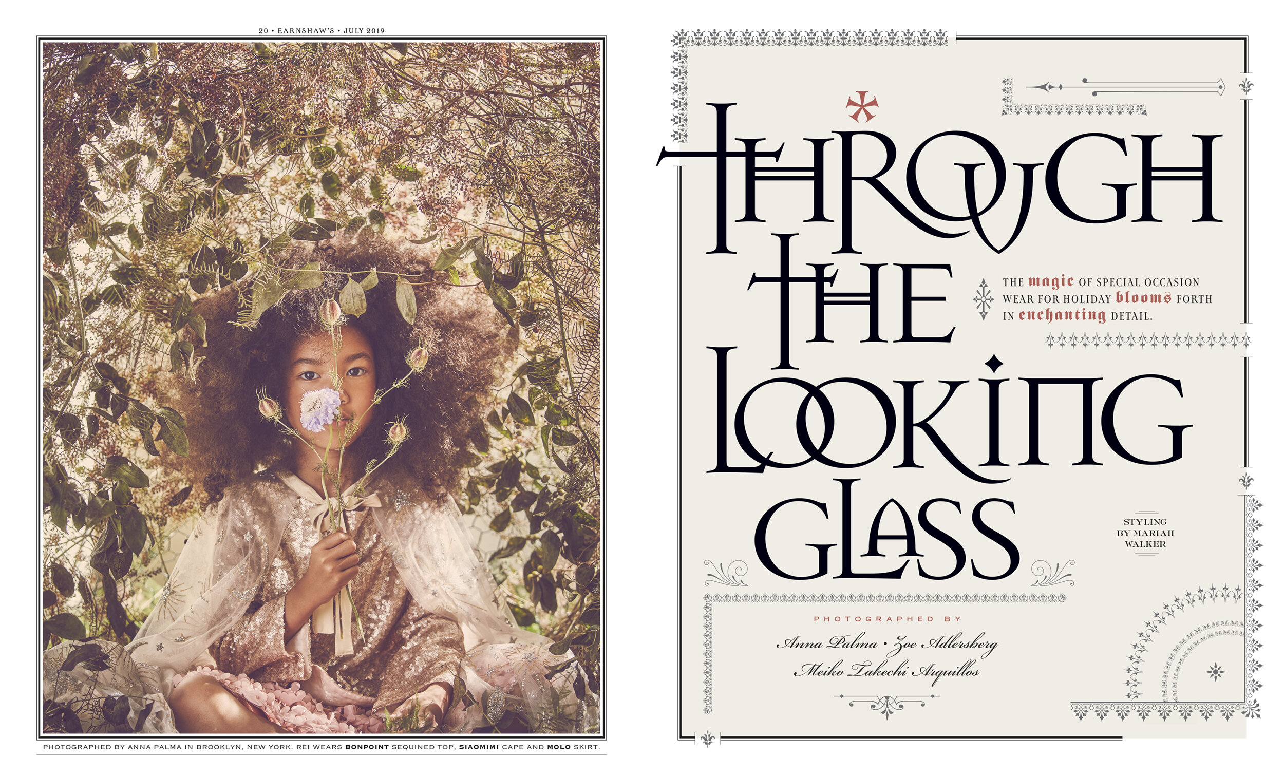
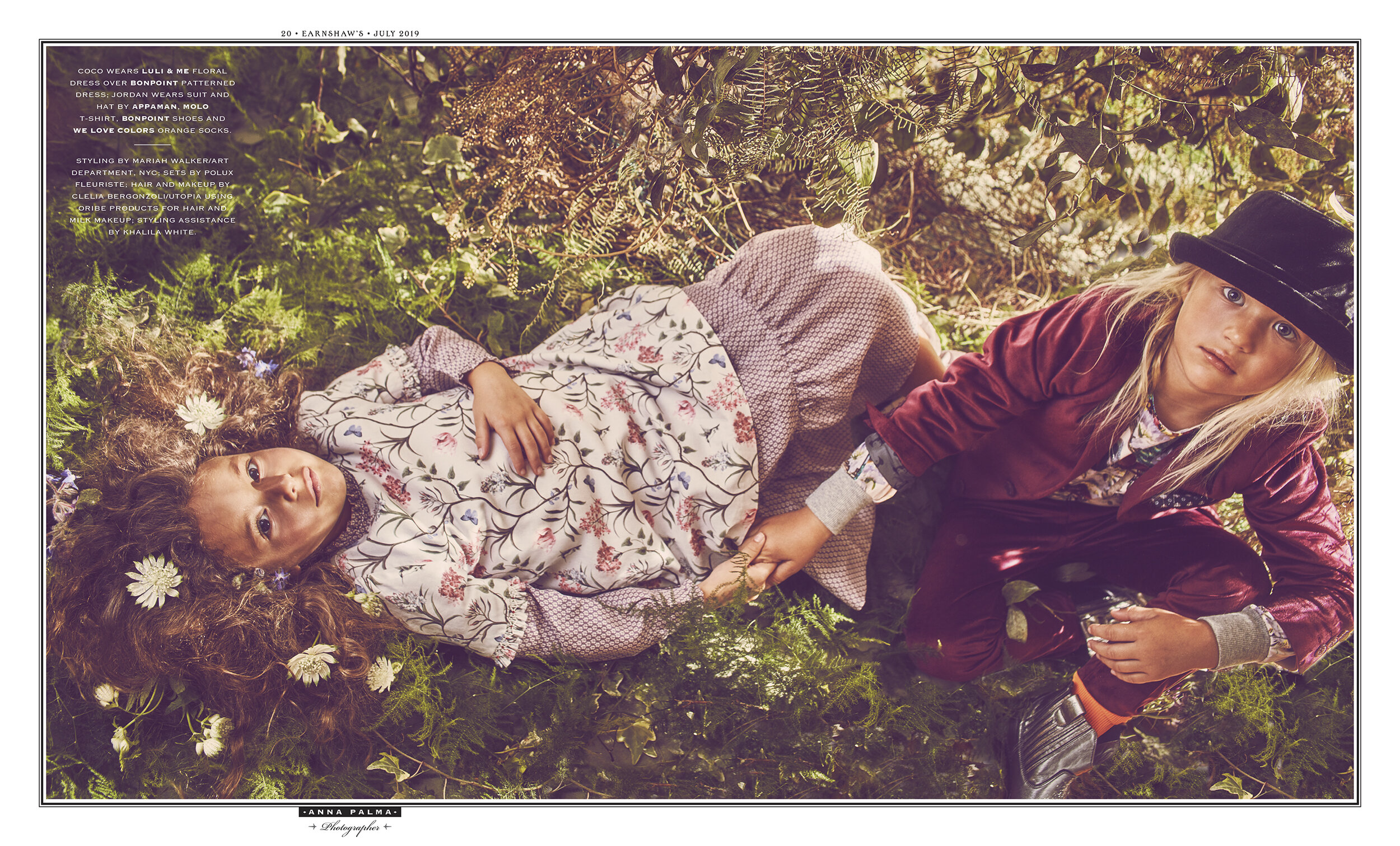
These photographs recall images by the painters Bonnard and Vuillard whose subjects would often became intertwined with the muted floral wallpaper of a 19th century drawing room. Edges dissolve in the lilting loveliness of soft light as the distinction between foreground and background becomes irrelevant. Just as those two great painters would do in the 19th and early 20th centuries, Anna Palma transforms her subjects into a mystical vision of nature. Click the image to see the second spread.

This cover won a design and photography award. Franck’s cover is one of the very best cover’s we have ever done and an instant classic. The typography in the headline is among our best and holds a special place in my heart.


"The Naturals" wins Communication Arts Design Award
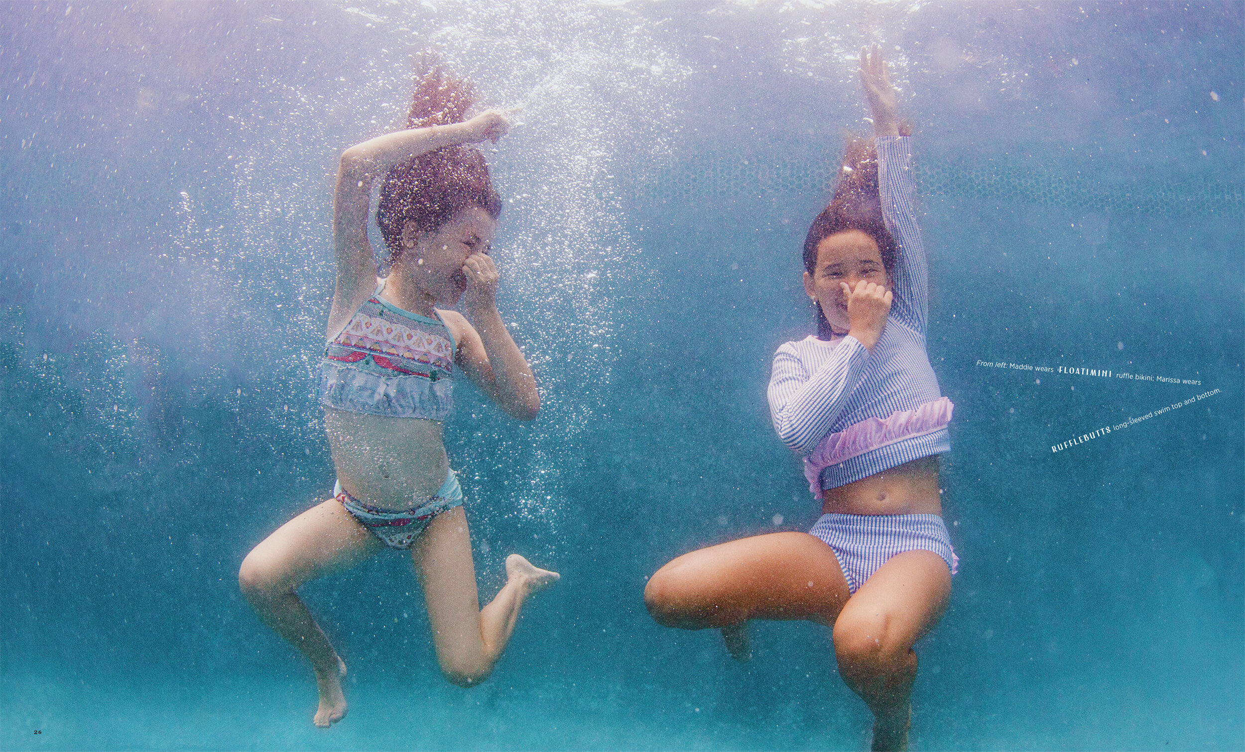
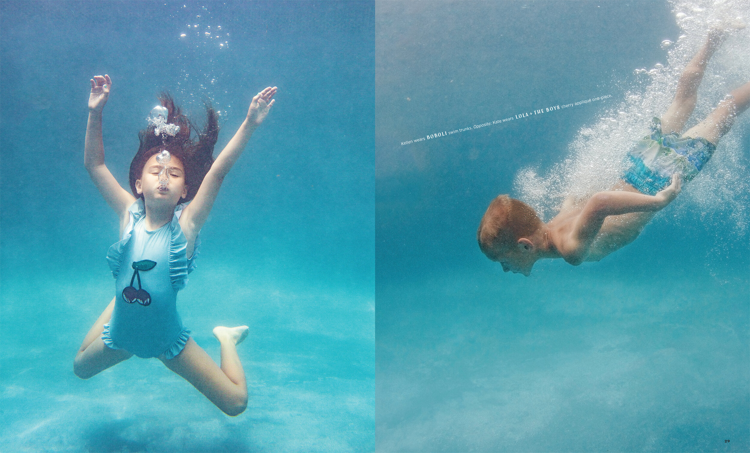
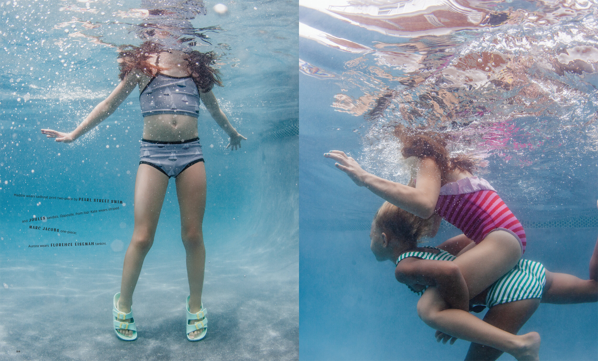
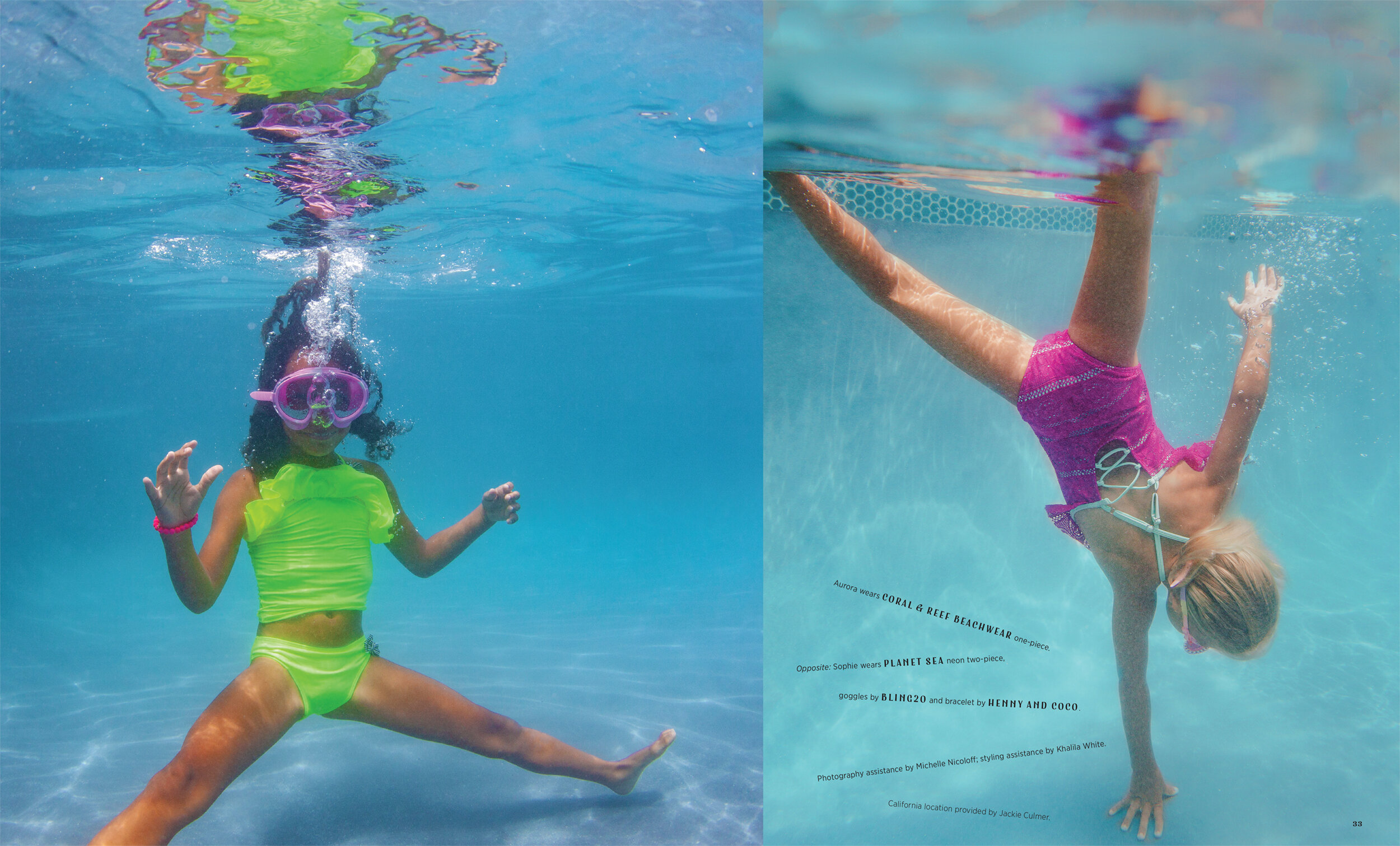
We are honored to have won a Communication Arts Design Award for the opener to our kids fashion story “The Naturals.” The story was photographed in Ibiza, Spain by the brilliant and talented Zoe Adlersberg and styled by the equally brilliant and talented Mariah Walker. This children’s fashion story appeared in the September 2018 issue of Earnshaw’s magazine.
Read More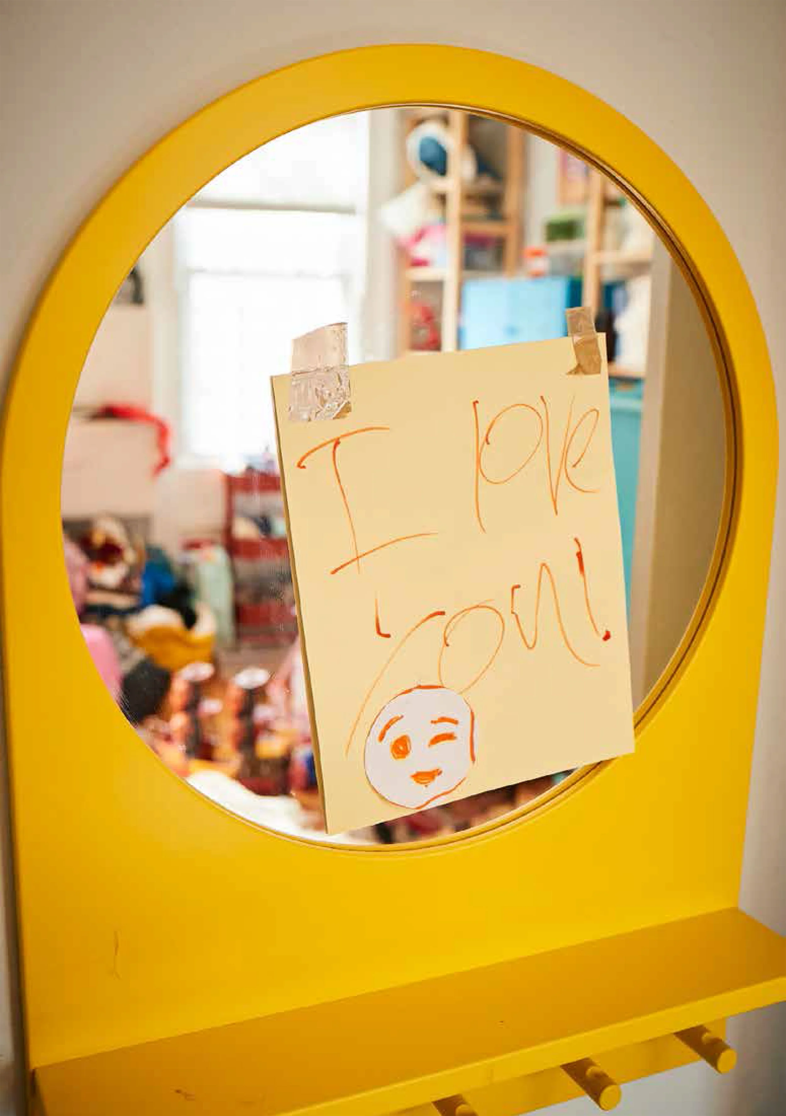
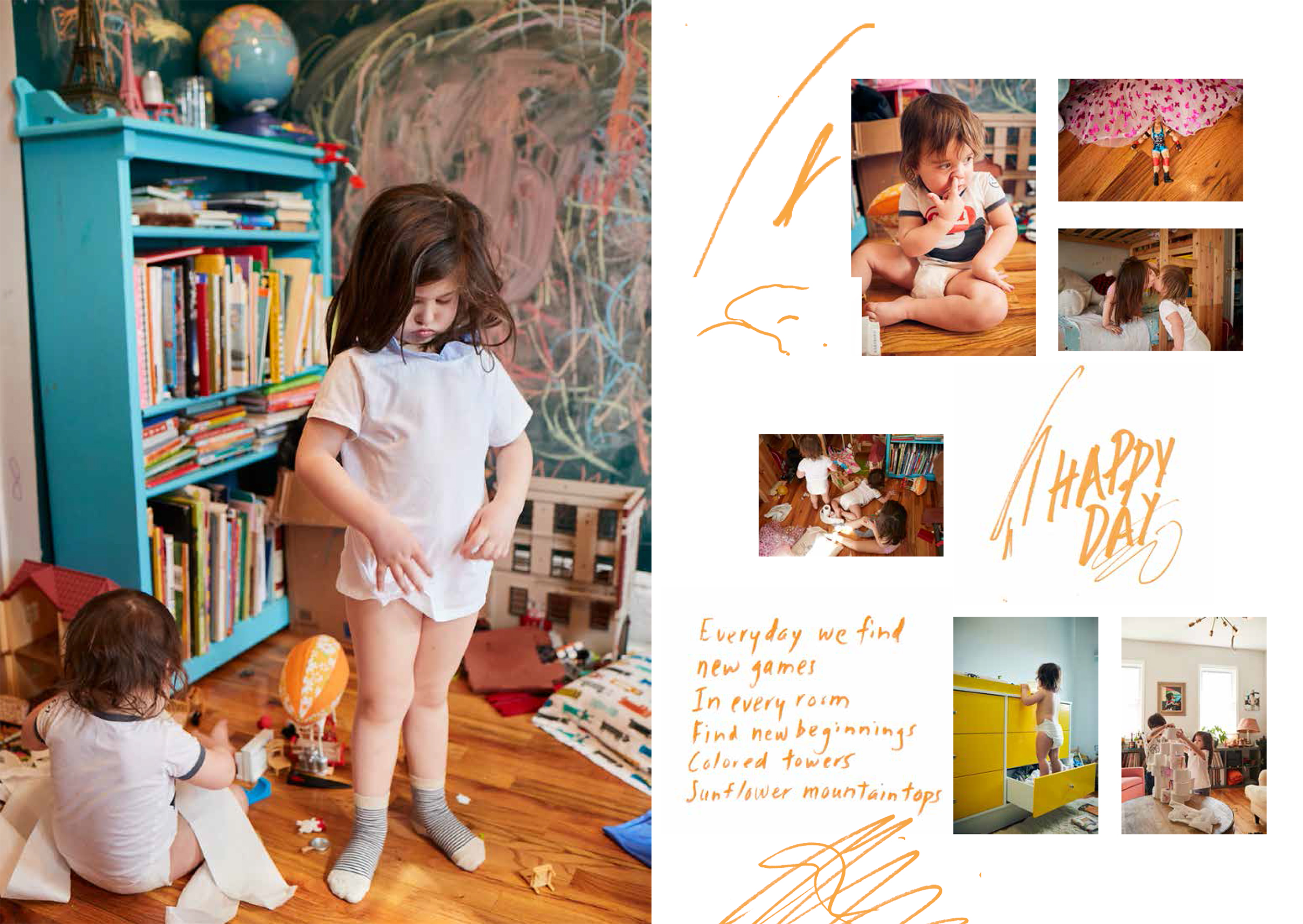
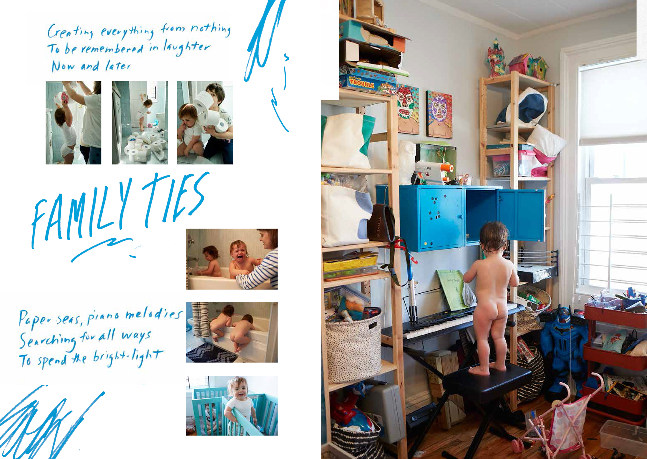
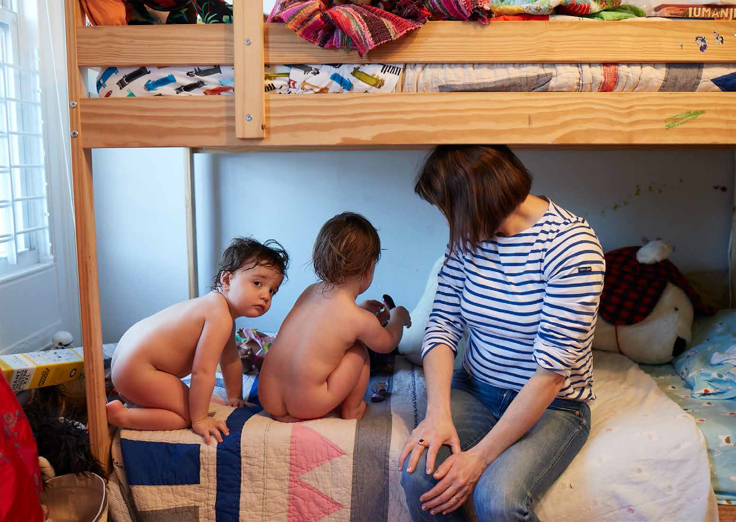
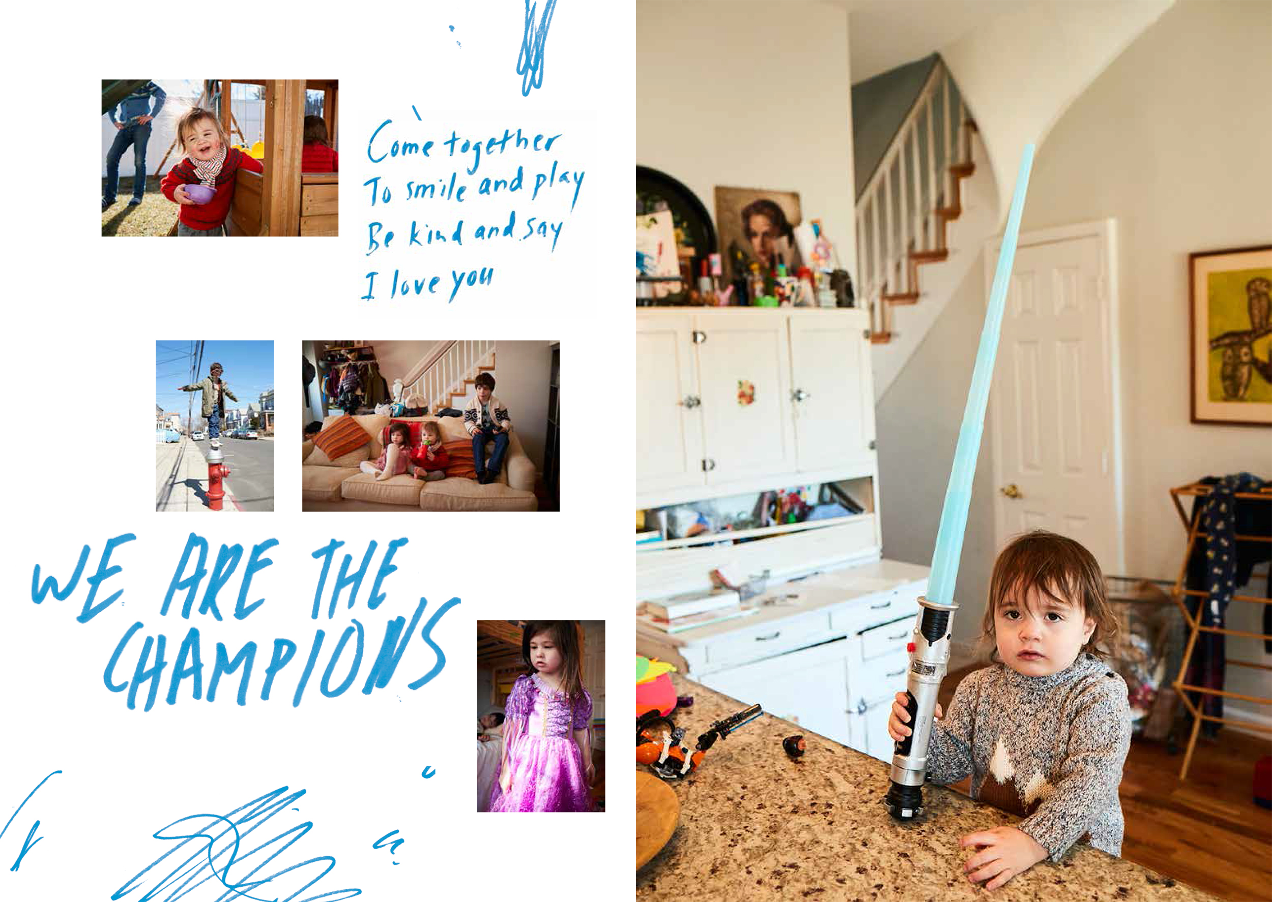
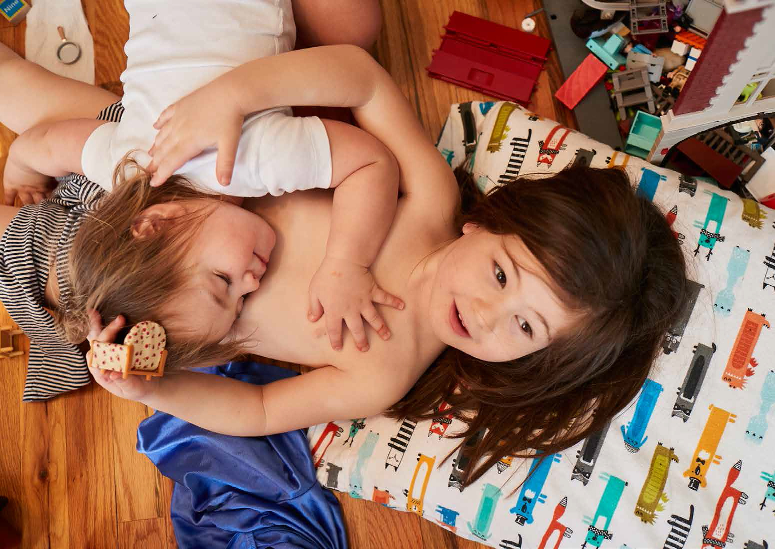
I LOVE YOU: PROMOTIONAL PIECE FOR PHOTOGRAPHER MARK ANDREW
Mark Andrew asked us to create a mailer for him to promote his photography. Mark is a fantastically talented photographer and director who works in a very spontaneous and free style. In that spirit we decided to create a piece that felt like it would be at home in an indie magazine that doesn’t follow the rules.

The first step was to find the images we thought would work together best. Mark gave us 124 images that we edited down to 25. The entire shoot felt like a little movie so we grouped the pictures together into scenes. Each spread is it’s own scene. In order to heighten the drama we interspersed full bleed spreads between some of the mutli-picture spreads. Pacing and scale changes are key in these types of layouts.

Step two was to enlist the help of our poetic art director friend and co-collaborator Katie Belloff. She wrote sweet little poems for each page and texted them to us. We wrote the headlines.
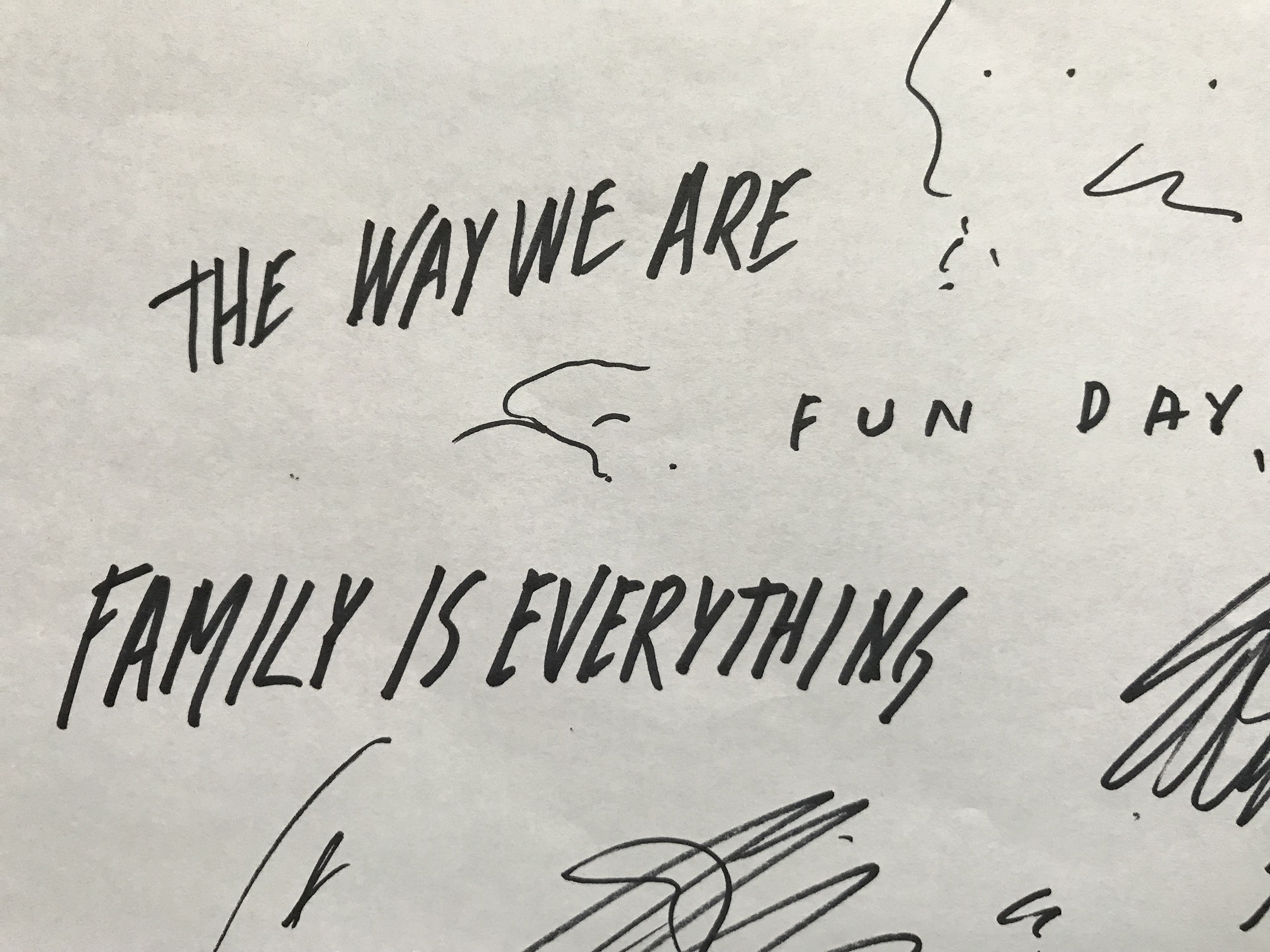
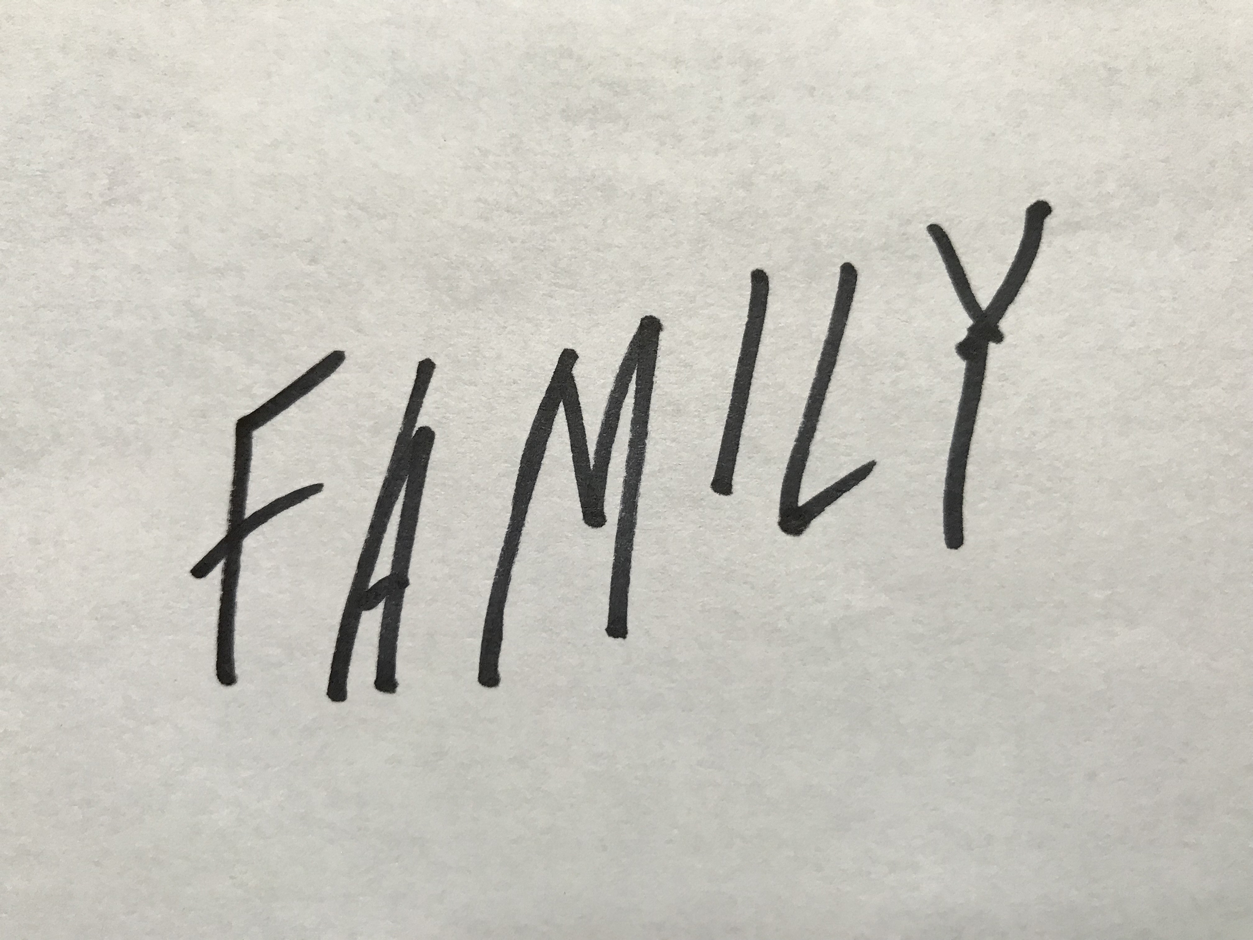
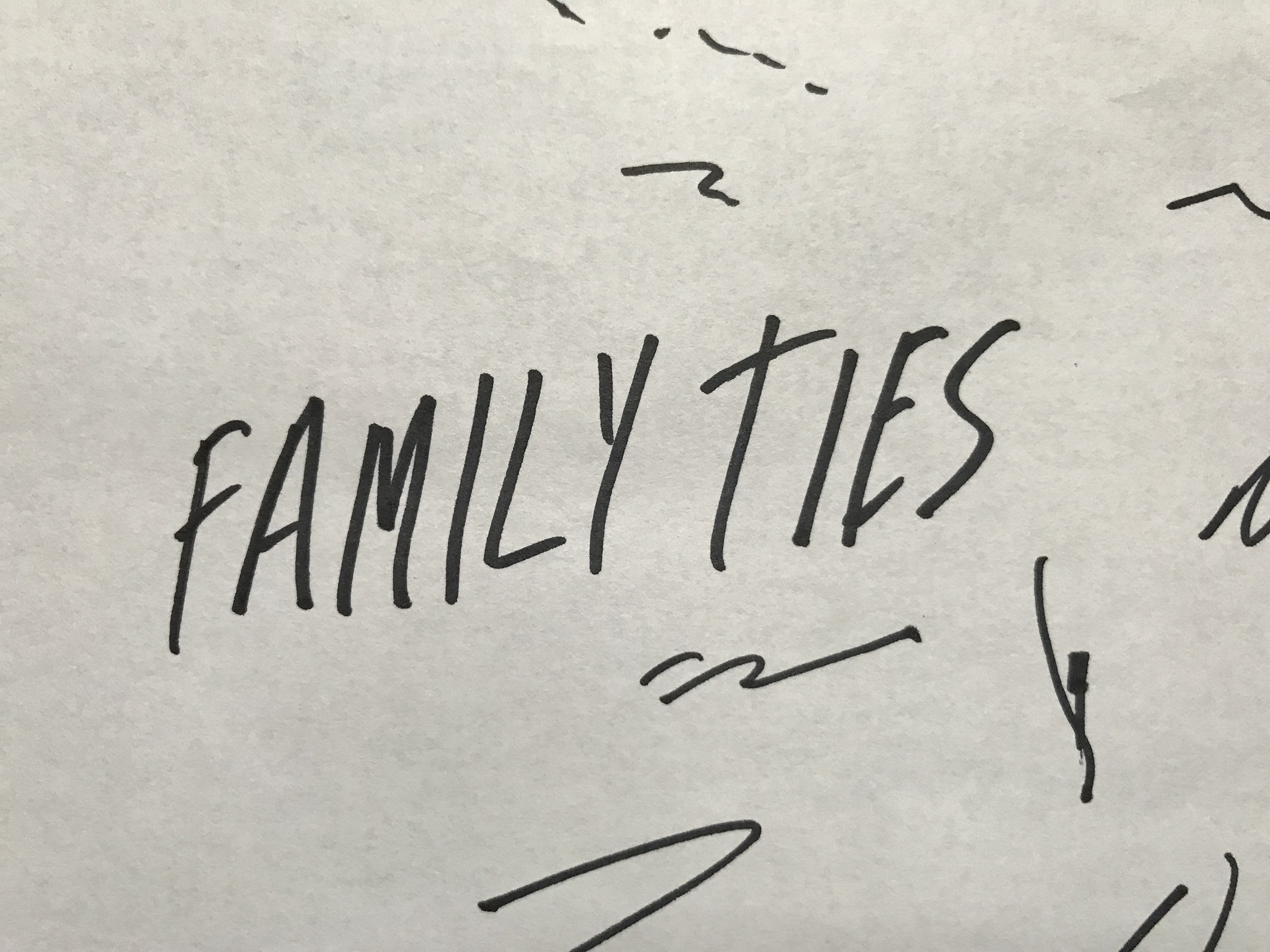
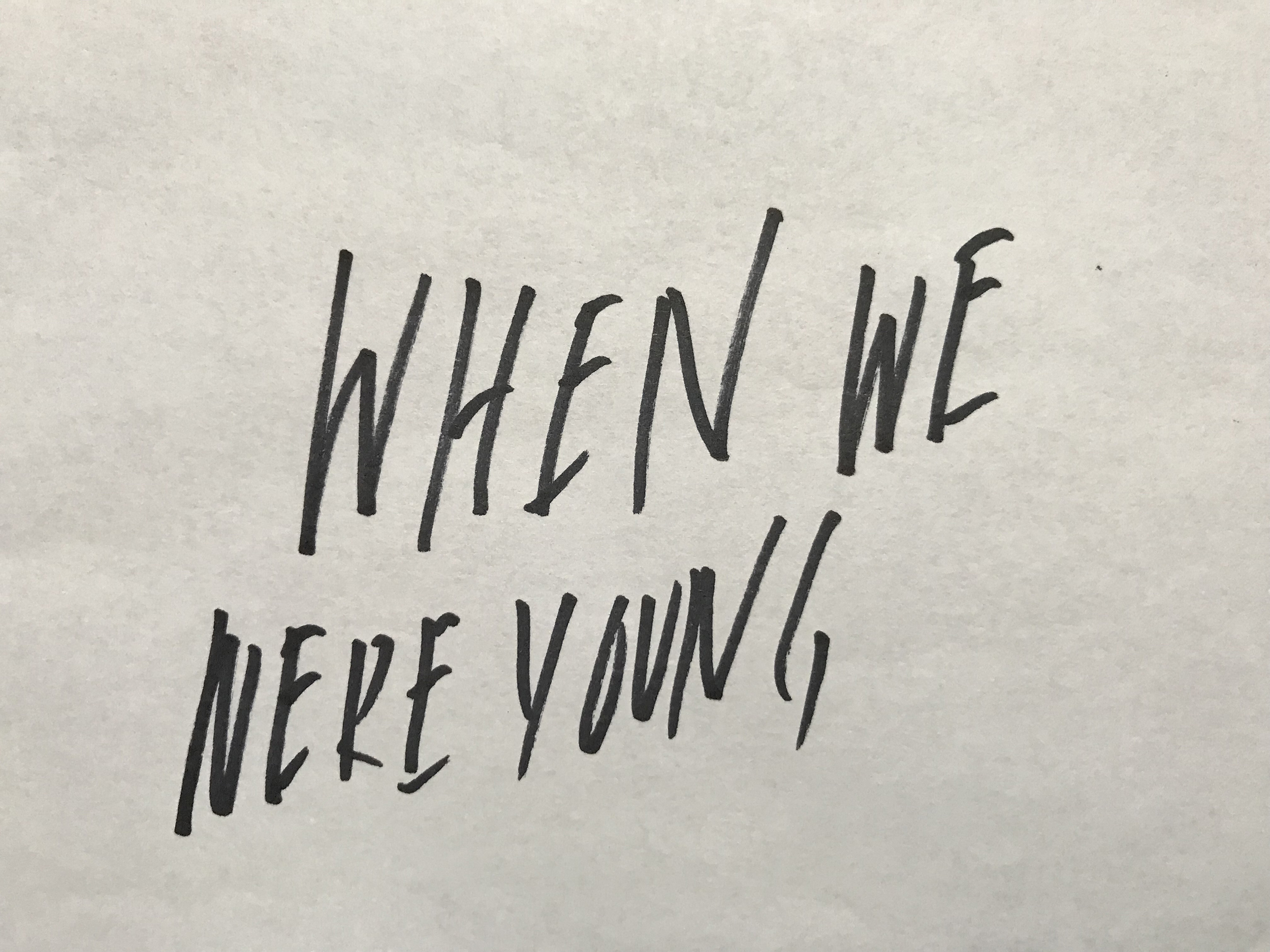
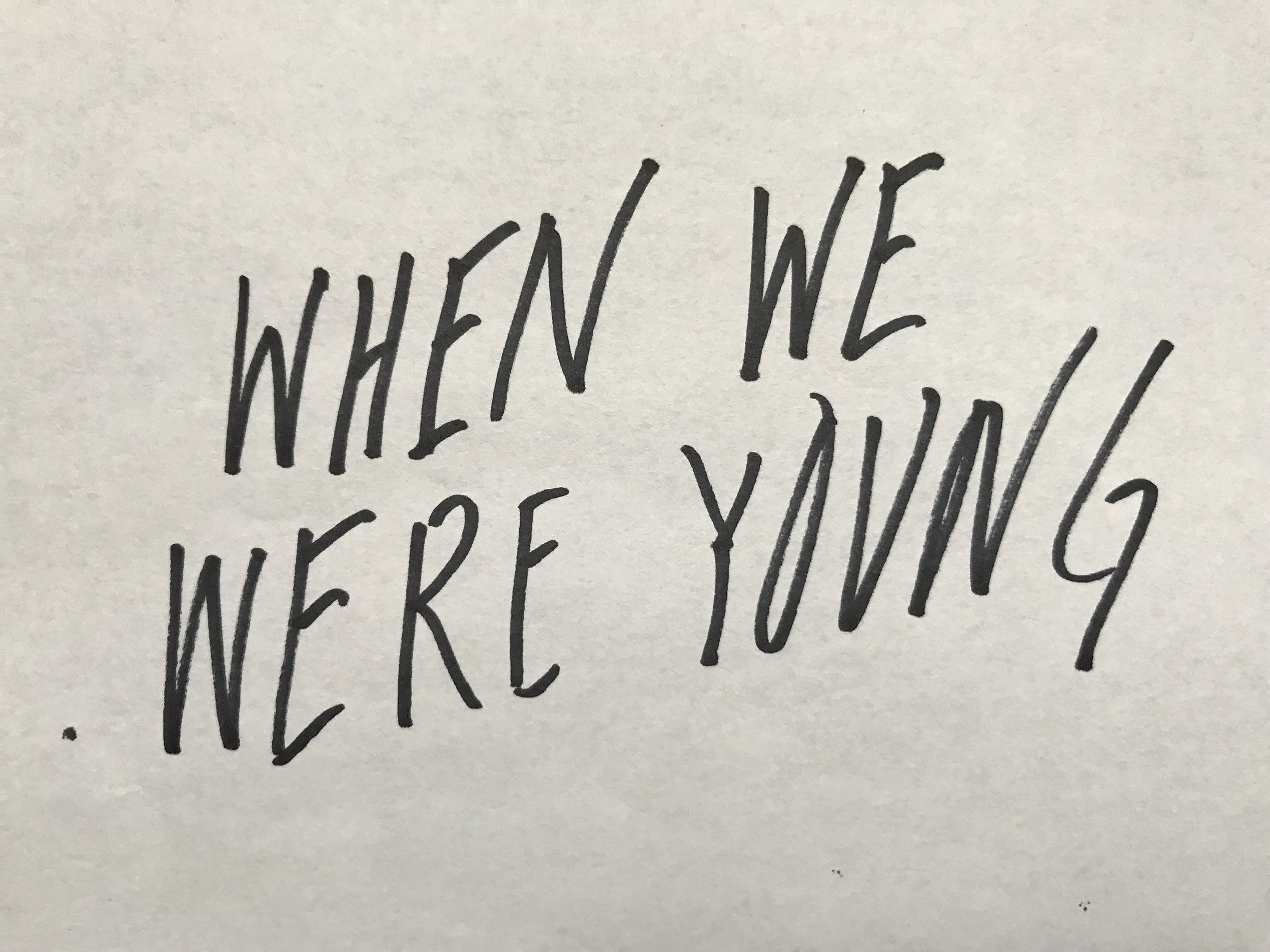
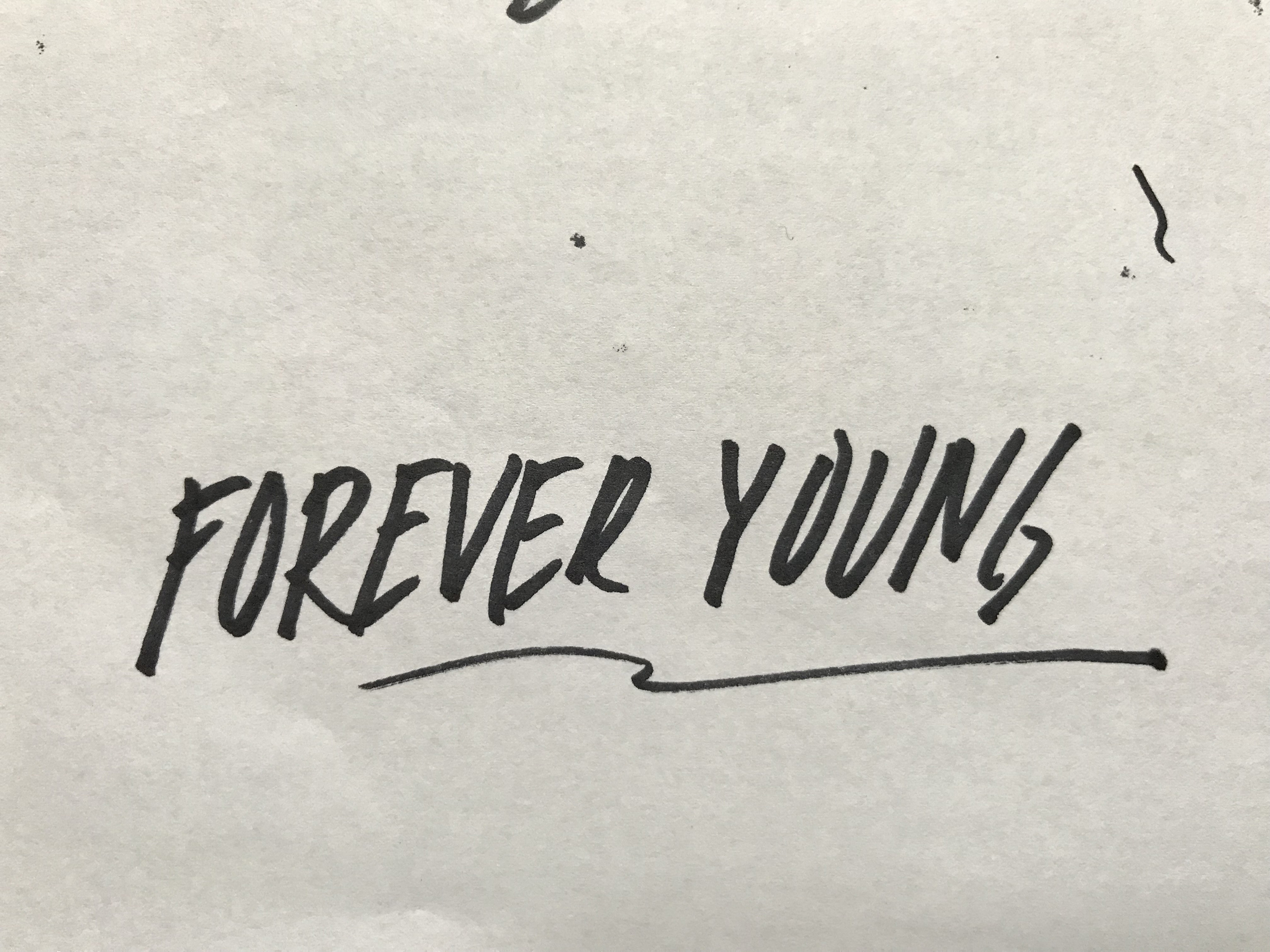
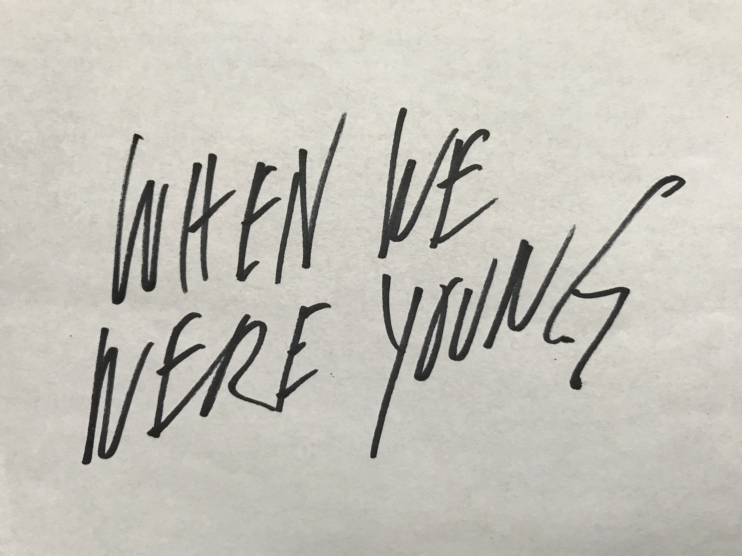
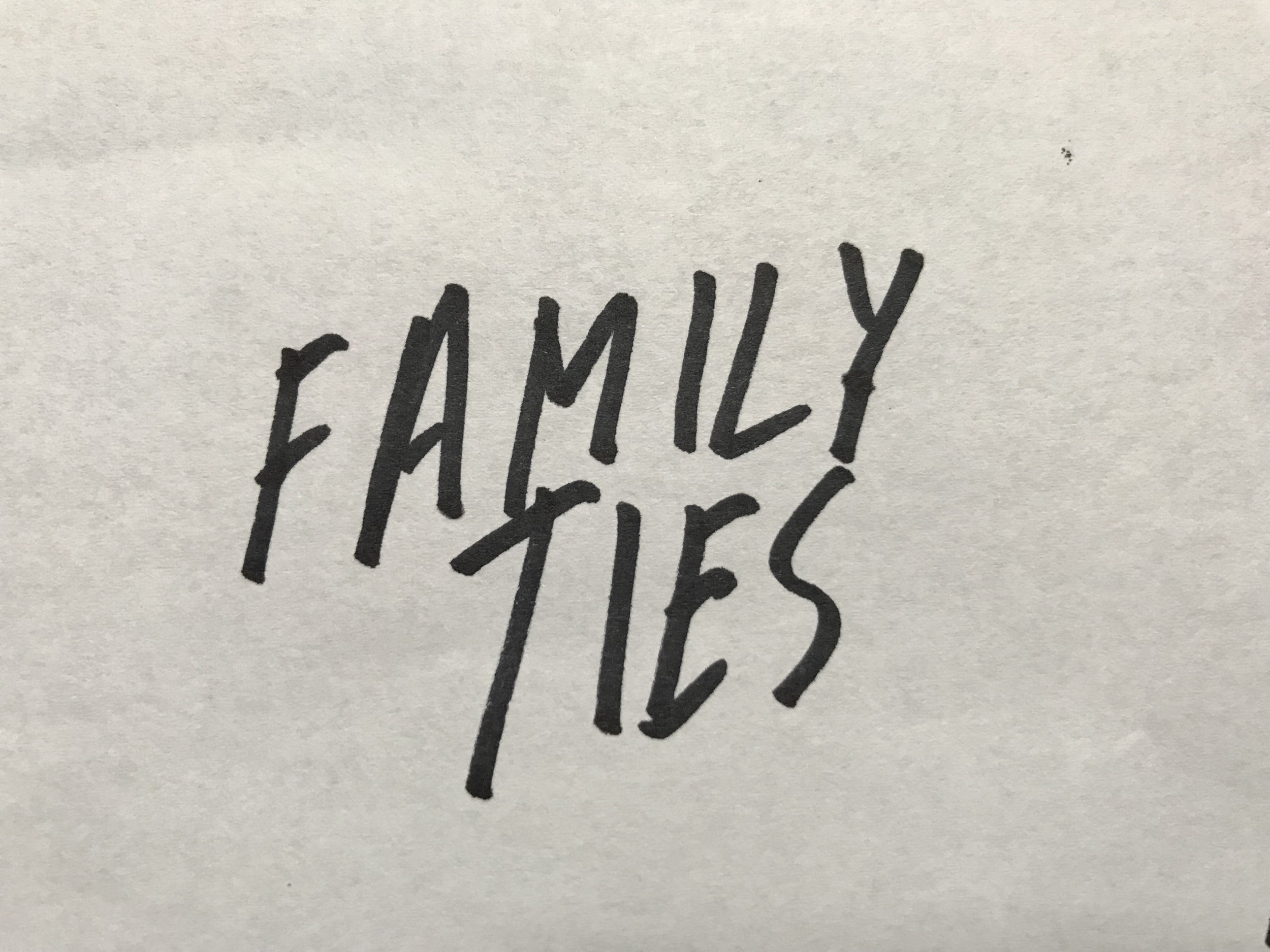
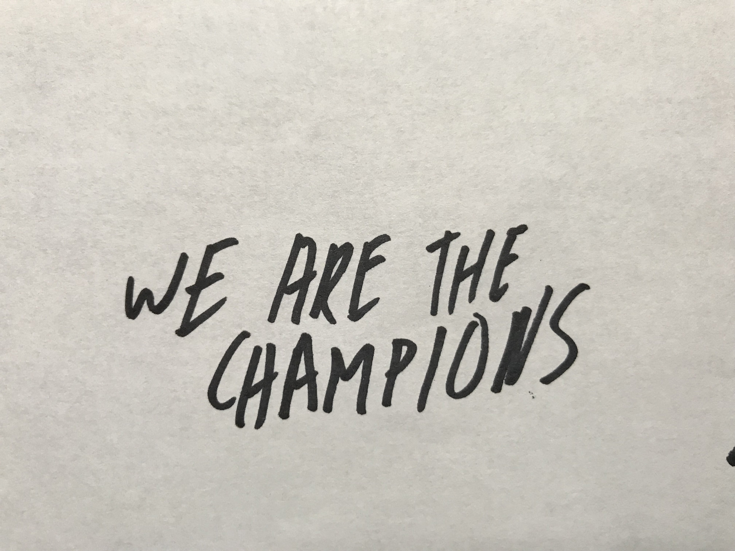
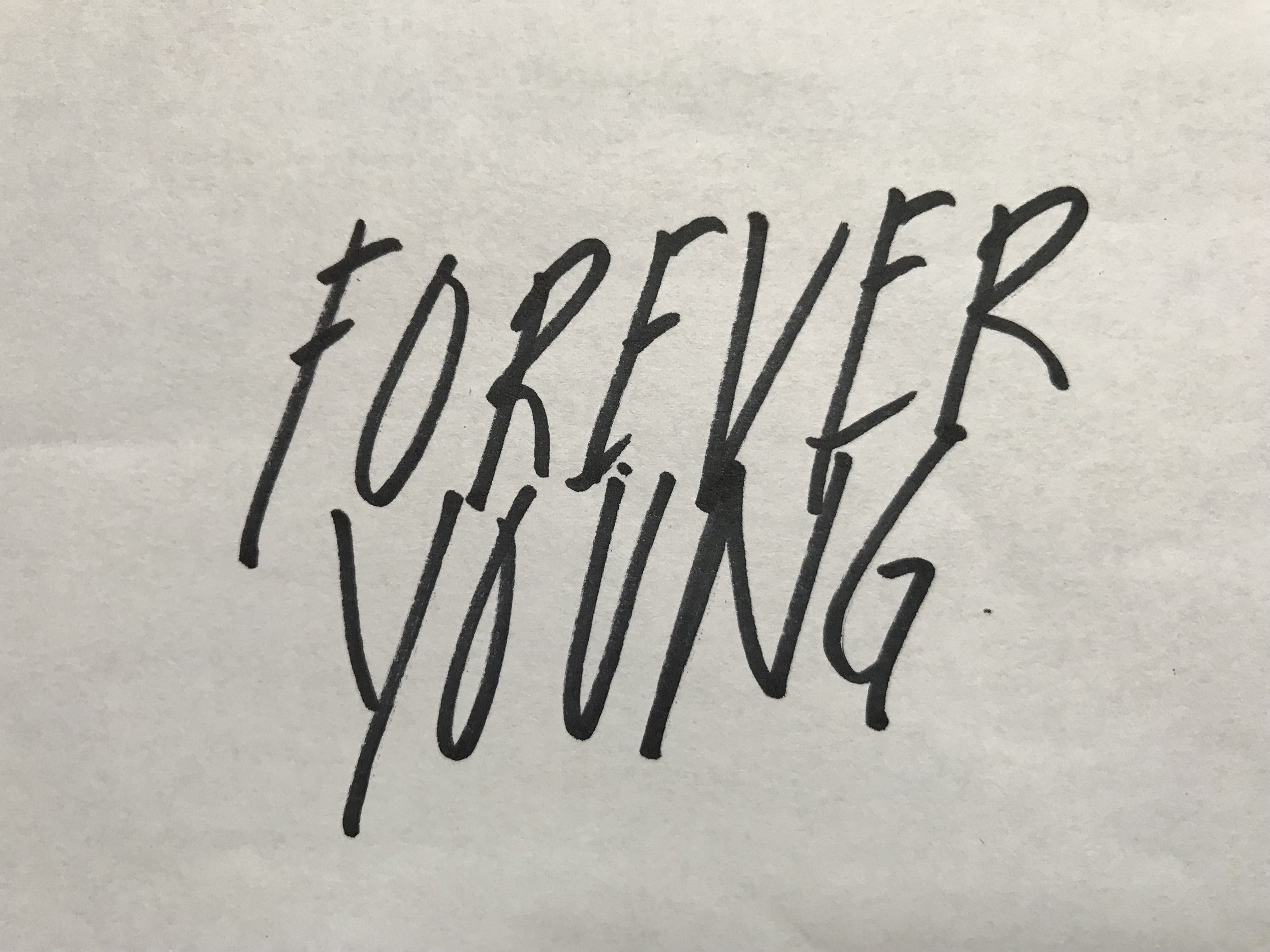
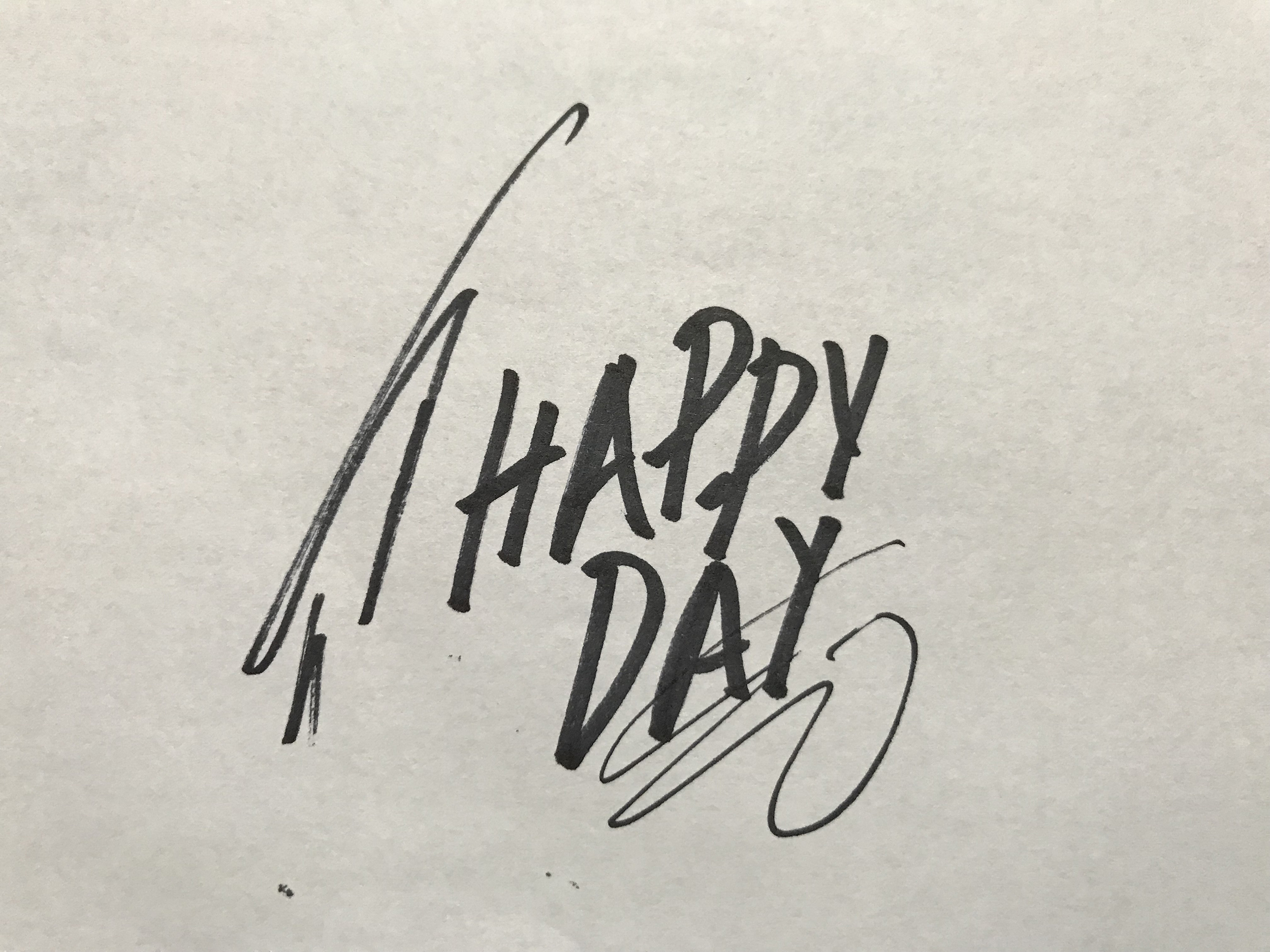
Now that we had our structure and our copy step three was to create our typography. Since Mark is all about spontaneity and moments we thought our type should reflect this feeling. All the lettering in this piece was done very quickly with a Sharpie on regular copy paper.
Our fourth and final step was to add color to our custom lettering and integrate it into our photo layout. Our color was directly inspired by the fresh and lively color in Mark’s photos. We are incredibly proud of this piece and honored that Mark asked us to work on it with him. We hope you enjoy looking at it as much as we enjoyed creating it!